White Christmas

As promised: Theme Decor Ideas! Theme One: 'White Christmas' (Thank you, Mr. Bing)

This one is SOOOOOOOO easy...it is based on the concept of a cocktail party, very chic, very simple, very Cosmopolitan (pun intended!). That being said, you can easily remove the references to alcohol and use other items, changing the focus but keeping the sleek, modern vibe. This design is all about using things you have already, things that you may not think of as 'decorations' - but with a twist and a flourish, they are!


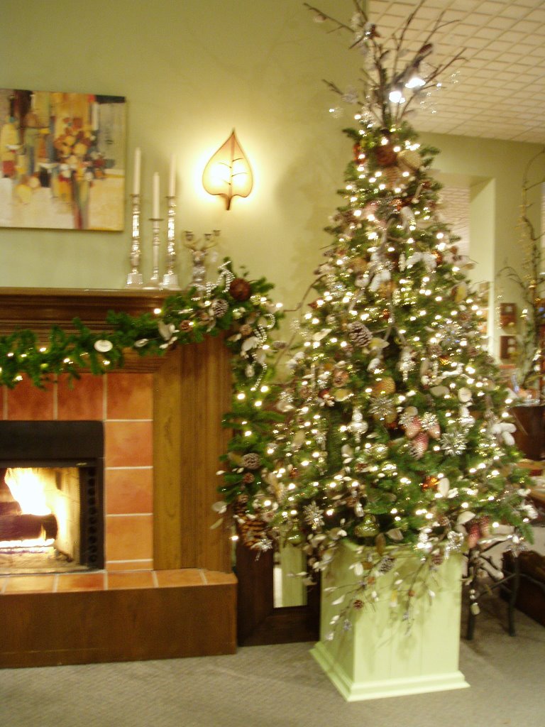
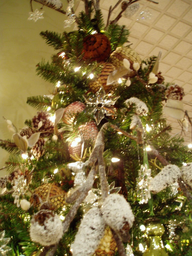
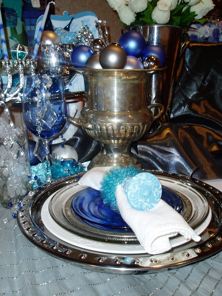
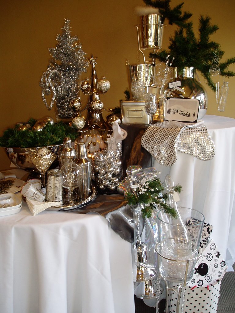
The photo above shows a variety of ideas, and they all started with household items. The glass and silver/aluminum barware, vases, and serving pieces all act as decor items. By adding a bit of greenery, some snowflakes (or Sno-Wonder!) and a minimum of ornaments, it becomes a low-cost, low-energy way to celebrate for a night or a whole season. My own holiday decor this year will be an expansion on this slinky theme! (With some chartreuse green added, of course....)

So, if you DO go with the cocktail party idea, haul out all of your shakers and shot glasses, champagne saucers & flutes, martini & wine glasses. No, I'm not advocating a go-for-broke binge, I'm helping you set the stage for decorating! Some of those glasses, and ice buckets, too, will look FABulous filled with ornaments. Simple silver, white, and clear balls. Grab 'em by the dozens for pennies at Wally's or Ksmart or Tar-jay. Or the dollar store, for unbreakable resin ones. (Good when you mix drinks, friends, and decor!) Heap them in there. The martini glass shown above has some silver tinsel in it to create a 'nest' (yes,m that's a theme with me!) to snuggle a vintage ornament in. Show off a few special ornaments by doing this - the champagne 'saucer' shown has a gorgeous silver bird-in a crystal ball ornbament sitting in it. Gather them on a tabletop, a mantel, a bookshelf. Easy, instant sparkle.

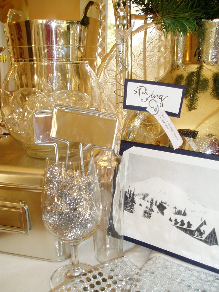
Black and white photos evoke vintage style AND Hollywood glamour - get some old movie stills of Cary and Bing and Frank and Fred, all tuxedo-ed and dapper, along with winter scenes. Hang them and prop them and scatter them around. If you will have placecards, try using silver-toned aluminum plant stakes, as shown above. Or simply a name on a card, tucked into a wire spiral in a clear glass bottle. You could add a chic white tulip or freesia flower, too. In that glass fishbowl above, you'll see some round clear ornaments - that aren't ornaments at all. They are the glass 'floating rings' that are made to hold blooms up above the water to float them. Pile cool items like this (and those big C-9 light bulbs too!) into clear bowls & vases for more sparkle. OR.....

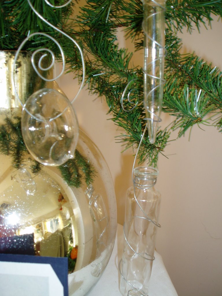
Twist some wire around them, and hang them as ornaments. Test tubes/florist tubes work really well for this, too, and enable you to have live flowers on your tree or hanging from your chandeliers.Easy, fast, simple! You can actually hang drink glasses on a tree, too - same concept. But really, with this modern look, you don't NEED a tree....

Unless it's one of those cool aluminum ones with a color wheel! ;o)

The Diva Does Woodinville!


I'm just too darned busy to do a proper blog post right now, so this will have to do...
Here's a photo of 'the Diva' in action last Saturday at the Willows Lodge 'Girlfriends Weekend' event, and the three decor displays I created. It was a blast, the women who attended kept me busy for a loooooong time after my presentation, answering questions and helping them with their own decorating dilemmas. I PROMISE that next week, I'll show photos and share tips for all three themes.I have so many fun ideas and time-saving tips for you! ('But first', as they would say on tv - and I just HATE that phrase, sounds like something quite unpleasant!- I have to host a family dinner and then decorate for a few more clients!)
Until then, Happy Thanksgiving!

USPS is TRENDY?????!

Have you seen the new Holiday marketing campaign from the United States Postal Service? It came in the mail yesterday, and I swear it nearly knocked me out of my chair...it's TRENDY, for heavens' sake! Since when is a government agency in tune with popular culture? Check this out:

Yes, you saw that right.....the HOT seasonal color scheme of red, lime green, and aqua blue...AND it's SCRAPPED! Talk about grabbing onto a wave and riding it for all it is worth. SOMEBODY down at USPS headquarters is a marketing genius, that's for sure. This mailer went out to residential customers....and with over 70% of the population scrappin' away, they are sure to win raves for this. I have to say, normally I'd recycle something like this - straight into the bin, that is. But THIS one...it's going on my inspiration board, just because it's so appealing to look at.


Every surface of the fold-out brochure is cute cute cute, filled with ideas and inspiration. I don't know who designed it (I'm not a 'scrapper', so I know very few 'names' in the biz, but I am a collage fiend!) but they did a fabulous job. It reminds me of the old Rudolph and Frosty animated specials, for some reason...a nostalgic vibe.
Oh, and it has some pretty handy info on mail deadlines & guidelines, too.... ;o)
Just a quick post to report that somehow I managed to do it right, and my web site is now live at it's new host.
Praise be to the Techno-Gods!!!! Now I just can't wait to have time to update it....maybe February?

Columbia Holiday Decor


This year we totally redesigned the decor for Columbia, buying new elements that reflect the crisp, clean, contemporary style of the new corporate logo. It's a refreshing change from heavy, dark colors, warm colors! We incorporated silver, white, tan, sage green, and bronze for a wintry look. Fresh and simply elegant, the tree, wreaths, garlands, and swags welcome guests and employees alike.

The tree was an 'issue'...for years, there has been a twelve foot tall tree just inside the entrance door, in front of a window. (It used to be fourteen feet - but they cut the top off of it at some point so it would fit. So it always looked like it was growing up into the second floor. Lovely.) With a circumference of about eight feet, that tree not only stuck out into the walkway, but also blocked any and all daylight coming in the window. (And here in the Northwest, that isn't much this time of year!) It also had a broken stand, which meant we had to wire the trunk to hooks in the walls to make sure it never fell on an unsuspecting visitor. SOOOOOO much fun. Anyway, we bit the bullet and bought a new tree, and relocated it's position to beside the fireplace. This pairs with the mantel garland and creates a gorgeous photo opportunity for guests. They are already having employees shoot their picutes in front of it, to use for Holiday greeting cards.

Now, buying a new tree should be no big deal...but it was.
First, the vendor sold out, so they called and told us we couldn't get the one we ordered. So, we had to go back to the showroom and choose another. Shorter. Tree. UGH. Two feet shorter. And THAT is why, dear reader, the photo above shows the tree sitting on a stand. It is a fab box that my handy carpenter hubby built and we painted to match the shop wall color. It holds the tree stand securely AND gives it that nice added boost of two and a half feet that makes for a stately pine. Perfect solution. To date, and to my knowledge, only six or seven employees have vocally mourned the passing of the big monstous tree. It sits ignored in the corner of the cellar storage area. I just tell them all it's 'cellar holiday decor', the easy way.


Some close ups of the tree decor... The silver stag ornament is a direct reference to the new logo, which features the cupola of the winery and the weathervane on top. Which, amazingly enough, is a stag. Funny how that works out!

Tickin' Away....


The Bangles said "Time, Time, Time...Tickin' away from me...."
Tim McGraw sings "Tickin' Away"... and every day I find myself looking at the clock more often than the day before.

This is NOT how I want to spend my holiday season!!!

So, major mind adjustment today, as I get down to the nitty gritty of designing the setups for my upcoming Holiday Decorating seminar. My new mantra: Time is irrelevant. I am seeking FLOW, that mystical mindset of the etherworld where time, space, limitations, and properties of the tangible do not exist. Today, I will enter into my chosen work with the attitude that I am a channel through which ideas and inspiration will flow from the ultimate Creator. I don't have to 'come up with' anything! I just have to let myself see the possibilities that already exist.

It's quite simple, really: I just need to let the stress go and focus on the fun!

As I work on my themed setups, here's a look back at last years' presentation:

Copper, Persimmon, and Chocolate Brown for fall
(the chocolate-scented candle I used is sitting beside my bed to ensure sweet dreams each night!)


Shabby Chic comes to Thanksgiving dinner, with creamy whites, gold, and sparkle.
A Diva Christmas, with hot pink, cranberry, red, and feather boas!
Hannukah at Tiffany's, with traditional silver, crystal, and blue.

This year I am focusing on three styles:
Contemporary (chic silver, white, crystal - and maybe some very mod black)
Traditional (red, white, green with a Christmas Teaparty theme)
Antique (browns, greens, golds, with an outdoor theme and NeSts!)

So, I am off to pull out boxes, rummage thru decor accessories, and create some very messy mayhem in the process. It'll be fun...

'Cause like I always say, "It's not called disWORK, it's called DisPLAY!" ;o)

Columbia Christmas Displays


Felt a a bit like one of Saint Nick's Elves this past week!

I spent all week at Columbia Winery, installing brand new holiday decor elements and all of the new merchandise displays in the retail shop. (Many thanks to my crew: Assistants Karen & Beth, Lisa & Janel!) A new tree & ornaments, new garlands, arrangements, wreaths, & festoons spiffed up the facility with a fresh feel. We finally ditched the old decor that I had been 'making do' with for years!!! The new decor is stunning, and a perfect complement to the new brand image of Columbia, which focuses on the Northwest heritage of the wines. It's evident in the stags' head ornaments, woodsy elements, and natural colors as seen on the recently launched wine bottle labels below...

The 'new' Columbia is contemporary Northwest style, and the products in the shop really are perfect.The front display features dichroic glass art on hammered copper tables, with overhanging mossy branches dripping bronze glass ornaments. Very 'woodsy' in feel and a perfect entrance to the winery. The second photo shows the back approach of one of the front displays - it features Vietri pottery in brown and white glazes, with leaf-embossed brown linen and pinecone candles. An elegant Northwest winter scene.
I've got loads more photos to share soon. First, I have to complete the transfer of the web site to the new host...