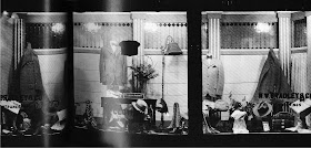
I found these photos of 1920's clothing store displays in a book I just picked up this weekend. The book isn't about display, it's about the time period, but this look into the past was pretty entertaining! I thought you might enjoy it, as well... seeing how merchants of past decades displayed their products is always educational.

The details of the scalloped top edge on these windows, and the stained glass panels in the top photo, are amazing.

Elegant, demure, graphic, and exceptionally well-lit would be my synopsis of these three windows from the W.W. Bradley & Co. Department Store (location not noted in the book). The last two perfectly illustrate the adage that 'Less is More', don't you think?

I love the last shot.The spacing, the levels, classic! Everthing looks very expensive.
ReplyDeleteHeidi