I'm currently in San Antonio, Texas for both business and personal reasons...
and along with visiting with my eldest daughter, her husband, and my son & grandson,
I had the pleasure of working with my daughter Jeni on her business.
She asked me to take a look at the reception area/lobby of her massage & yoga studio,
I had the pleasure of working with my daughter Jeni on her business.
She asked me to take a look at the reception area/lobby of her massage & yoga studio,
with the idea of making it both look better and function more effectively.
A Mom just can't say no to her kid when the kid gives her permission to basically
take over and do anything she wants with her biz, so......
See what I did after the Jump!
Before:
A Mom just can't say no to her kid when the kid gives her permission to basically
take over and do anything she wants with her biz, so......
See what I did after the Jump!
Before:
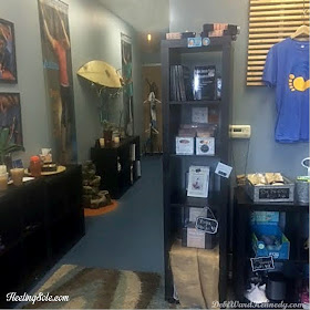
The view directly ahead of you as you walk in the double doors.
The hallway leads to the massage rooms and storage areas.
The hallway leads to the massage rooms and storage areas.
A closer view of the 'retail area' -
minus a LOT of the products on the upper unit.
I forgot to snap photos before we started stripping it!
minus a LOT of the products on the upper unit.
I forgot to snap photos before we started stripping it!
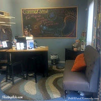
to the right of the 'retail area' is the reception desk.
behind the desk is a large chalkboard, and a big heavy file cabinet.
A fabulous loveseat offers customers a place to wait for services/classes.
... and we're back at the entry.
The painted concrete floor is softened with cushy rugs.
On the left side of the entry is the door to the yoga studio,
and the 'yoga shoe cubby' which leads into the hallway.
There were some storage issues, and also some traffic problems,
so I addressed those:
1. When clients sit on the loveseat, awaiting their massage or yoga class,
the staff continually walks right past them, in VERY close proximity, to and from the desk.
This causes the clients to have to swing their legs out of the way multiple times. Not good.
2. Also, the 'retail area' wasn't organized or offering customer-friendly access,
This causes the clients to have to swing their legs out of the way multiple times. Not good.
2. Also, the 'retail area' wasn't organized or offering customer-friendly access,
plus it was placed in a less than optimum location...
because when clients arrive for a massage or class, they aren't in the mood to shop.
They want the services.
They want the services.
So seeing the retail products first thing isn't actually a good plan...
let them see it after class as they come out, and they'll be more relaxed and ready to BUY.
3. And the desk itself wasn't really organized, so employees had to repeatedly get in and out
3. And the desk itself wasn't really organized, so employees had to repeatedly get in and out
to access supplies in the course of doing their reception jobs.
The plan:
1. Switch the location of the retail area with the loveseat,
enabling us to address the traffic flow AND retail location issues.
2. Maximize the visibility of the retail products with concise and accessible presentation.
3. Utilize the available storage placement for client files, paperwork, and retail products
as effectively as possible, using the fixtures on hand.
Jen had a great original visual concept AND some great elements on hand to work with,
so the redesign was pretty simple.
Two NEW (but free!) items were added to the room:
Two NEW (but free!) items were added to the room:
*a large seagrass rug - came from Jen's home
* a large wood pallet - 'pilfered' from a furniture company dumpster
First we emptied the room of everything except the heaviest furniture
(file cabinet, desk, printer table)
then placed the new seagrass rug on the floor - and the space felt immediately larger
with a singular surface over most of the visible floor space.
(Those two rugs in the 'before' shots were soft, but they chopped up the space visually)
We patched a few holes on the walls and touched up the paint.
While that was drying, we hauled in the tall pallet and leaned it against the wall
with a singular surface over most of the visible floor space.
(Those two rugs in the 'before' shots were soft, but they chopped up the space visually)
We patched a few holes on the walls and touched up the paint.
While that was drying, we hauled in the tall pallet and leaned it against the wall
where the loveseat used to be.
________________________________
Important Detail: This wall is problematic.
It's concrete, and does not accept screws. It also doesn't like adhesives.
Nothing Jen has ever put there stays on the wall.
(The large marketing banner seen in the before photos was hung from the drop ceiling)
Nothing Jen has ever put there stays on the wall.
(The large marketing banner seen in the before photos was hung from the drop ceiling)
So the pallet was a great solution to provide vertical hanging area for merchandise,
and stability was provided when we placed the HEAVY file cabinet in front of it.
That pallet isn't going anywhere.
____________________________
After:
Apparel merchandise is displayed on wood hangers hooked onto the pallet slats,
That pallet isn't going anywhere.
____________________________
After:
Apparel merchandise is displayed on wood hangers hooked onto the pallet slats,
and hung from a few tiki torches shoved into the top of the pallet for height.
(There is a decidedly 'beachy' vibe here!)
(There is a decidedly 'beachy' vibe here!)

On top of the file cabinet, and next to it, we placed two of the four-square cubby units.
They hold ALL of the merchandise, which is now neatly folded by design and size,
or corralled into galvanized containers.
Everything is accessible, viewable, and shoppable.
Small chalkboard signs provide price info.
Small chalkboard signs provide price info.
The loveseat moved to the opposite wall.
A huge wood slab 'bulletin board' with event info and two great marketing photos
were moved from the hallway to the wall behind the seat.
because when you win 'the Best of San Antonio' FOUR years in a row,
then you have bragging rights. Use them!
(note: Jen doesn't have all of them at the office yet, so there's room for this to expand to hold them all.
She won 'BEST of' in Massage for four years,
(note: Jen doesn't have all of them at the office yet, so there's room for this to expand to hold them all.
She won 'BEST of' in Massage for four years,
and 3rd place Yoga last year - her FIRST year with a yoga studio. Proud Mom here!)
.
.
Here's the bonus of putting this material on this wall:
It's all visible from the glass front doors.
So when the studio is closed, people can look in and SEE
It's all visible from the glass front doors.
So when the studio is closed, people can look in and SEE
the awards and the large photos that show what Ashiatsu Massage is actually all about!
The desk was moved to a 90 degree angle from the wall instead of its previous angle -
which opened up the right side for better employee access.
That large file cabinet is also within easy reach of the desk while being away from clients' eyes:
That large file cabinet is also within easy reach of the desk while being away from clients' eyes:
A small table with drawers tucks in next to the file cabinet on the right side -
the bonus is that it holds a small office-supply drawer stack, it's not visible to clients,
and it doesn't block the light coming in the window.
On the left as you enter are the 'yoga cubbies', and they haven't changed.
We removed one 4-cubby unit to use for the retail area,
and that lightened up the hallway by opening the space up more.
Another wood slab bulletin board hangs here,
Another wood slab bulletin board hangs here,
with class info.
.
.
Bonus: the open area makes the small fountain's noise more prominent,
adding to the peaceful environment.
These two 'uncluttered' solutions enhance the feng shui of the space,
These two 'uncluttered' solutions enhance the feng shui of the space,
very important considerations for a health-conscious business.
Here's a side-by-side of the transformation:
Here's a side-by-side of the transformation:
Items we took out of the space and did NOT re-use in it:
* one tall black cubby unit
(it now sits horizontally and holds yoga mats in the yoga studio)
* the slatted wood wall shelf unit
(It was actually a headboard, and went back to her house to be used as such!)
I think my 'You don't have to use a thing the way it was intended to be used' is genetic ;)
I think my 'You don't have to use a thing the way it was intended to be used' is genetic ;)
* the round and rectangular rugs
(they went home to her family room)
I created the plan for this in half an hour on one afternoon,
and the next morning we loaded the rug from Jen's house
then picked up the pallet on the way to the studio.
We started on the changes at 9:30 AM, and finished at 12:30 PM.
That's about 4 1/2 hours total time invested. And not one cent.
You CAN make a HUGE impact in just a few hours without spending any money!
When done, we went out for a relaxing lunch with tasty hibiscus margaritas,
then went back and Jen gave me one of her
'Most Luxurious Massages on the Planet'.
I was JELLO!
I consider those both a complete bonus,
I was JELLO!
I consider those both a complete bonus,
because working with her on this project was just a whole lotta' fun.
Want more info on award-winning Ashiatsu Massage in San Antonio?
Check out Heeling Sole Barefoot Massage !
Want more info on award-winning Ashiatsu Massage in San Antonio?
Check out Heeling Sole Barefoot Massage !


Thanks mom! Everyone who walks in the new lobby LOVES the layout! They are all commenting on how big it feels, how much more calmer it feels when you first get in here, and I'm really digging all the retail products in one REACHABLE place. Before this they were at all different heights, and I didn't think it was a problem at the time, but it totally was :)
ReplyDeleteWow! It's awesome. Looks like a much better flow and therefore more relaxing!
ReplyDelete