Playing on the 'Time' theme from my last post, it's TIME to get visual again... I've shared a lot of biz info lately, but need to get back to my 'roots' (so to speak). Providing visual inspiration for your retail merchandising is always my favorite topic - and number one goal.
Today, let's look at the art of displaying antique and vintage items. It's not easy - for one, you usually only have one of every item to display. Then there's the fact that you often can't plan too far in advance as to what the display will contain, because you can't just order it from a showroom - you have to meticulously search out every product you sell. And then you have to combine things in a way that makes them all look better, fit a theme or tell a story, and appeal to shoppers.
On the plus side, no one else is EVER going to have these products and display them as you will. The most successful dealers display vintage items in vignettes and groupings that make them look stylish and relevant to decor trends. No longer do customers want to see a 'granny's attic' look when they walk into antique stores - they want to see ideas that will help them integrate antiques into modern homes and lifestyles. (Just as when shopping for brand new products, it's the value-added 'inspiration quotient' that can make the sale). Those funky vintage alarm clocks in the photo above are a perfect example of this.
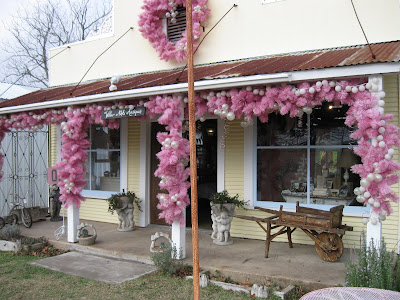
There are a few people who excell at creating a signature style for their antique wares, and among them are Linda & Ludmil Marcov of Willow Nest. Their new store in Burton, Texas is, as expected and shown in photos on their blogsite, absolutely awe inspiring. Charming. Creative. Inspiring. Entertaining. Which are all things that retail should be!

The outside of their little shop. You can't ignore this. Heck, you can't resist this!!!

Sweet Linda and the inside of their little shop. This is a lousy photo but it is all soft whites and creams and pale pastels. I can imagine this on a hot Texas summer day - a complete oasis of calm and cool. She has created a mood, a place, a story that transports you to another time.
Linda also keeps a space in Round Top/Marburger, at Texas Rose Antiques. It's a metal barn, folks, and yet when you walk inside, you see this:
...another one of Linda & Ludmil's enchanted environments, created solely with their products and props. It matters not what the building is, they create a separate world. Which is a good thing to remember for retail - you control the environment. Paint it, drape it, light it, panel it, but do something with it. Create a 'set' for your products to 'star' in.
As you move through this barn, space after space of loveliness unfolds...


These look like pages from a magazine, don't they?!!! It's not due to my photographic skills, it's the marvelous merchandising of the dealers here. Owner Vikki is a darling gal who chatted with us about the area, the shows, the biz, and how all of her dealers work hard to present merchandise in a fresh new way - not the old 'musty crusty' jammed-full shelves of antique shops of old. (We also discussed how all of us crazy people in merchandising and antiques seem to be from California originally. I do find that pretty interesting.....)

Outside the main barn is a tiny little shed, just 10 X 10. Inside the shed is this scene. A sign identifies it as 'Gypsy Rose Antiques'. Please don't tell me that your store is too small to be merchandised effectively! Edit edit edit and tell a clear story. Don't get crowded or muddled or confused. Be simple. Be direct. Be unique.
These are but a few examples of people using creativity and style to display and sell antiques in various venues. Other stellar stylists of vintage goods are Deb Dusenberry of curious sofa, Kaari Meng of french general, and of course Rachel Ashwell of shabby chic (and fret not - Rachel will stay in business after the recent bankruptcy filing). Do check their web sites and blogs out, and take a look at how they have created an aesthetic for their own stores that fits their brand image. You can do this too!
Photo Credits: All taken with permission, at Willow Nest Farm and Texas Rose Antiques.


Hi Debi,just stumbled on to your blog.I am Co-owner of Todays country store in Sumner Wa.My partner Kris and I have been showing people how to mix vintage finds with new modern for over ten years now.We've been in our brick and mortor for ten years and have had to reinvent ourselves over the years,but we have always loved the vintage chic look.Please pay us a visit if you ever get south of Seattle 30mins.only or stop by our blog at www.todayscountrystore.blogspot.com
ReplyDeleteOops!our main blog is www.todayscountrystore.typepad.com and my own personal blog iswww.amysvintagecottage.blogspot.com I have a similar picture posted with the alarm clock.:)stop by if you have a chance.:)
ReplyDeleteDebi, I agree with almost everything you wrote about. I am so glad the "throw it on a shelf and charge top dollar" antique stores are going away. I am from Wisconsin and I think I would fit right in with you California girls. Love your Blog.
ReplyDeletekath