Showing posts with label summer. Show all posts

5.01.2026

Red, White, Blue... #WhatsInYOURWindows ?

  
Summer is here (unofficially) and if you haven't done it yet,
it's time to refresh shop windows AND online photos for the season.
Gather up the red, white, and blue products & props in your storage room
and let's get you in motion to create effective displays!

Continue reading for classic summer display ideas,
created for a resale store in Southern California...
plus links to MORE posts with MORE ideas!

6.01.2024

Summer Display Switch-Up!

I'd like to revisit an archived post, to show you how making a fast, simple but large-scale change
can make an incredible impact in your retail displays for the summer season...
Come with me on a lil' trip into the past!
 I created displays for Columbia Winery in Washington state for six years. Here's the 'logo' wall made of faux tumbled marble tiles in the front entry of the shop, filled with spring merchandise.When it came time to install the new summer displays one year, we had a bit of a dilemma: The summer merchandise is very contemporary, and in colors of white, silver, and blues. With that warm-tone, old-world style tile mural, we had some serious clashing going on that did nothing at all for the product.
I needed a solution.
Enter two very large mirrors that I had on hand, purchased for decor at a previous Auction of Washington Wines Winemaker Dinner. I decided to use those mirrors to cover up the tile. (IKEA, $135. each). I had my design assistant Karen help me heft them up onto the table, then I wired them to the sidewalls. There was still some tile showing, so I hung a white drapery panel on the side. In front of that went one of the two driftwood trellises that I purchased last year as summer props. On the top, to camouflage about six inches of tile, I hung white shutters at an angle - very 'Tommy Bahama'. Other shutters went beneath the table to lighten up the shadowed area a bit.

The result?
It was shockingly different from the previous look, and got a LOT of positive comments!
The mirror not only reflected the natural light coming in the windowed front doors straight across from it,
but it also bounced light from the overhead trac fixtures right down onto the glass merchandise.
Here's a shot of the entire main display, including the forward area with wine feature.
The tables are made from driftwood, and are for sale. Those driftwood trellises weren't for sale. The white chair was mine, and also was not for sale, just a prop. (That I fished out of a dumpster - really!)

It took maybe half an hour to install the mirrors, curtain, shutters, and props for that front display.
  Well worth it, wouldn't you say?

Now, think about what you might be able to do in your retail space....
with some old doors, or a section of cedar fencing, or maybe even salvaged rusty corrugated tin roofing.
The possibilities are endless, 
and the impact of a big change could be just what you need for the summer season.

Now.....where are my sunglasses? I'm heading for the beach......

this content originally appeared here on DWK visual merchandising blog in 2007.
photos mine, copyright reserved. 


5.31.2023

what's in YOUR windows for the summer season???

.  
summer is here (unofficially) and if you haven't done it yet,
it's time to refresh shop windows AND online photos for the season.
gather up the red, white, and blue products & props in your storage room
and let's get you in motion to create effective displays!

my best VM tip:
Selecting a general theme and a seasonal color palette is what works for us in this resale store.
The choice of a patriotic palette for summertime is easy, and draws customers like flies.

It can work for you, too, no matter what you sell - 
because a window 'set' that can simply be filled up with new products on arrival
saves everyone time & effort.

continue reading for classic summer display ideas,
created for an upscale thrift/resale store in Southern California...


6.04.2022

@ Liberty: Patriotic Vintage Display

Imagine, if you will, Lady Liberty... 
stepping down from her pedestal on Ellis Island to enjoy a summer yachting excursion.

That, in a nutshell, is the premise behind the summer theme
in my friend Liz's booth in an antique mall in San Diego!
Liz hired me to assist her in gaining some serious WOW factor in her booth,
which is in the WINDOW of the gorgeous shop.
She brought the goods, and I helped her with a design plan and styling services.

... and I think I can safely say that her booth is definitely a WOW!

See the fireworks after the jump.....

7.06.2014

Holiday-Specific Displays: Yes or No?

The day before Independence Day, I hit a local thrift store
where the display shown in my photo above was right inside the entrance.

OK, yes, I critiqued it in my head - and honestly,
they passed with flying colors!
This is Goodwill, not Nordstroms,
and so the simplicity is very successful
AND easily changed when customers want to purchase items from the display.

Remember that Goodwill does not stock lines of product - 
everything is basically 'one of a kind' in there - 
so things sell out of displays regularly.

Here's my question for my readers:

Does it PAY to create holiday-specific displays in your store?
Do you reap the benefits of the time invested?

Does it spur sales of products with limited shelf lives
at full price and before a certain date?

Do you see NOTICEABLE sales increases of seasonal merchandise 
if you feature it in a themed display?

Me? I LOVE themed and holiday-specific displays.

I believe that one display in a store, and in a window,
gathering up all of the related product
and presenting it in a united theme,
can really help customers SEE what you offer,
be INSPIRED to take it home 
and re-create the look
for their own homes & celebrations.
 
It's easier than having products scattered all over your store,
forcing customers to wander and search everywhere
to see what you offer...

If your customers come in for patriotic napkins, and they find them in the napkin section,
they will grab them, check out, and go home perfectly happy with their napkins.

Yet if those napkins are presented in a small display
along with plates, candles, candle holders, and table runners, 
the customer would most likely purchase MORE items for their party...
meaning your per-transaction total just went up.
(Remember that old sales adage that says 
'It's easier to sell MORE to an existing customer than to GET a new customer?' It's true.)
Not to mention that they go home ECSTATIC that they found more wonderful things!

So give your existing customers the opportunity to buy MORE from you than what they came in for.
Give 'em napkins - and everything ELSE they need for a spectacular party table setting!


This subject has been on my mind for the past week,
because I have seen many PERFECT opportunities 
to present Patriotic, Red-White-and-Blue merchandise in three specific stores that I work in.

I have heard guests (customers) ASK for those products -
because they couldn't see them.
Yet there was no solution of a centralized location for the merchandise, 
no display to draw the guests (customers) attention to them with theme or color,
and no apparent concern that those products with a limited shelf life
existed in the stores and needed to be sold THIS SEASON.

By 'limited shelf life' I mean that there is a short preferred
'window of opportunity' to sell them effectively - 
not that they are perishables.
Fourth of July products sell best the two weeks immediately before the holiday. At full price, that is!

It confounds me that a company that I believe has
the best merchandising in the world
missed the boat on this one. And it's a BIG BOAT!
(like, white triple-deck paddle wheeler riverboat big,
if you get my drift!)

I asked about the lack of such displays in those stores,
and was told 
"No, we don't really do that here."
Well...... maybe they SHOULD.
It's the busiest time of the year, people are looking for and wanting this product,
and other parts of the locale are promoting the Patriotic color palette, and do themed displays.

People want to join in that celebration...
so why are these retail locations making it so hard for them to do so?

Ultimately, it's negatively impacting the store's bottom line AND the guest (customer) enjoyment.
I'm going to try to get to the bottom of the reasons behind that decision...
because I KNOW that I can implement new displays
 in every store I work in within minutes -
and make them a lot of money.

Vintage display by Seabold Vintage Market . Bainbridge Island, WA.

It's entirely possible to pull together an effective display 
just by quickly uniting items from all over the store by color and theme -
I could accomplish it in less than 30 minutes per store.

 You don't have to invest tons of money, effort, or time
or big props and backdrops and fixtures to get results.
Just take the opportunity to give your customer
what they want 
in an easy,
"don't have to think about it, just grab it and buy it" way.


Goodwill Industries delighted me
with their very simple and effective Patriotic entry display.


The specific stores I am thinking of need to do the same.
What about yours?


5.02.2013

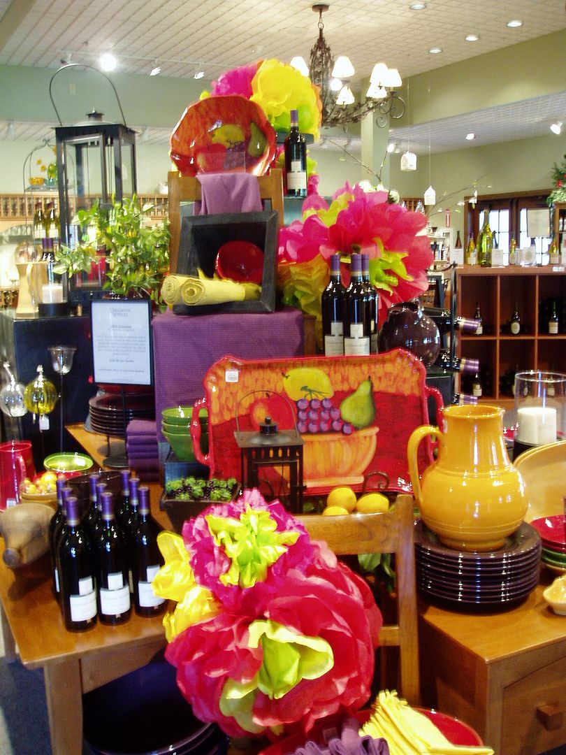
EASY Cinco de Mayo Display Props!

Here's one of my favorite fast display prop ideas...
 perfect for Cinco de Mayo and summer style!

The props for this display are simply
 large flowers made from colorful tissue paper.
Took me about fifteen minutes to make them, and cost less than five bucks.
The HOT pop of color in large scale draws your eye from across the room,
instantly conveying the idea of 'PARTY!!' without being overwhelming.

More about the mechanics of this display after the jump...

7.29.2009

Display is Like Playing Dominoes...... Everything Moves!


Changing your store displays for each season is VITAL!
Variety is needed each month to keep customers interested and returning.
The photos above show a sunny, bright, cheerful summer look 
in the front room where you enter this darling vintage boutique.

New product had arrived, so it was time to feature it in the front room. 
In a small shop, when you move one item, it affects everything else. 
The product that was here was relocated to another room - 
which meant that everything in that room had to be rearranged as well, 
to accommodate the merchandise. 

It's like lining up dominoes and watching them fall! 
[I'm not sure if it's an 'official' industry term, but 'Domino Effect' certainly applies here...]

So, I'd like to know: how often do you change the displays in your store? 
Windows? Front of Store/Entry? Interiors? Point of Purchase? 
Have things been the same for longer than a month? Two months? THREE months? 

Hey, folks, retail is change! 
If we never brought in new products, we'd be outta' business. 
Same is true with displays - you have to mix it up, move it around, make it fresh and new 
to stop your customers in their tracks. 
Otherwise, they just walk on past, thinking 'Been there, seen that.
Yes, it's work... it's time... it's effort..... 
but it's a foolproof way to increase customer awareness of what you offer. Isn't that worth it?!

5.31.2009

ReDesign Redux

In another post, I shared this photo 
as part of Phase Three of the Retail ReDesign Project at Poppyseeds. 

Not two days after that room was restyled, 
two people fell in love with the table and chairs - within five minutes of each other! 
After being in the store for a year, it sold. LOVE that! 
That's what effective displays can do!

Of course, the sale of large pieces of merchandise is wrought with its own challenges - 
getting it OUT of there, and then the gaping space that is left.  
When the shop owners asked me 'So now what do we put there?', 
I was able to expand on one reason why using the 'Zone' concept works:  repetition.

I told them to get another white or red table and chairs set and put them there. 
Why? 
The room is set up as a retro kitchen, with cabinets, a vintage stove, 
a china hutch, and another vintage kitchen dinette set. 
It makes sense to stick with the theme and the color scheme 
that we have chosen to focus on for the summer tourist season in this room.

Following this guideline, 
they know that tables and chairs painted in red, white, or aqua will fit in here - 
when one set sells, bring the next one in. 
Each one will be unique, because the furnishings they sell are vintage and recycled items, 
so the look stays coordinated while the product is always fresh. 
Even a patio table and chairs in white metal would be appropriate. 

It's a way of simplifying choices, focusing their marketing message for the season, 
and saving the store staff time and effort.

The girls already had a few items in stock, awaiting a paint job, 
so they created a new white table and some red and blue chairs, and brought them into the room.

Now, it looks like this:
Small products and more detail were added after this photo was taken...

Can you see how this continues the same story with a new twist?
They can just keep doing this in this room - and all of the others, 
according to the color scheme and design theme - all summer long. 
Then, for fall, we'll come up with some new themes and restyle the rooms again.

You can do this in your stores, as well, by using the Zone concept for developing themes and displays. 
Need help? Give me a shout!

If you are in the Seattle area and like what you see here, check out Poppyseeds in Stanwood. 
Just 60 miles North of Seattle and 24 miles North of Everett, 
the shop is a great place to visit on a sunny weekend!
(Camano Island is a nearby five-minute drive over a bridge, too)

4.04.2009

Colorblind


In my recent post on design*sponge for the Biz Ladies series, I discussed 'maximizing your visual impact'. I shared some advice on how to express your business brand image in various ways. Yesterday, I was at a local shopping center and came face to face with a perfect example of how this concept works..... or, rather, how it doesn't work when you don't utilize it!

See that logo up above? What do you think of when you see that? Tanning. Sun. Warmth. Relaxation. The Tropics. Summer. You picture being surrounded by warmth, right? Even the colors in the logo are warm and vibrant, supporting those ideas.

Inside the doors of this establishment, you'll find THIS:


OK, well, maybe they were thinking that you get hot while tanning (not really) and need a nice cool atmosphere around you. Or that in sunny climes, like the tropics, the sky is aqua blue and the water is bright green. Maybe that was their train of thought. Maybe. I'm not sure. Most likely, they just picked some colors out of the blue (pun intended).

I DO know that the colors of minty green and aqua are not universally flattering to skin tones - even tan skin tones. And when you are in the business of helping people look good, then you darn well better make them look good! How much more golden, gorgeous, and TAN people would look if they were surrounded by golden, warm and SUNNY colors? This is one of the most common mis-steps by businesses: Not seeing their environment as an extension of their logo, brand, and business image.

The simple act of relating your business name, tagline, logo, and colors to your environment is like visual merchandising 101 - but instead of just products, your whole business is what's on display. You have a chance to surround your customer with your brand, and it can make or break the image that the public has of your business. In this case, 'maximizing visual impact' was simply a matter of what paint colors were used on the walls & ceiling. And the opportunity to leverage their brand was missed.

Had I been advising them, I would have guided them to make successful choices that extended from those paint colors to the furnishings chosen, the music played on the sound system, and the scent wafting through the rooms, as well as the apparel that the employees wore each day. Every detail could have expressed the brand image.

But it didn't. Maybe that's why the shop now looks like this.

PLease understand that I'm not picking on this business, I'm using them as a way to make a point. You have to plan out every facet of your business. You have to create your brand image, and make decisions about how you will present your services & products to your customers in every single visual medium you use. It doesn't happen by accident. It happens by design.

Those bright happy colors aren't wrong, they are just wrong for that particular business. Put a gelato or ice cream or cupcake company in there, with those aqua & mint walls. Add a soft chocolate brown as an accent color by painting large circles or swirly designs all over the walls, and bring in some warm globe lighting and mod tables & chairs. Create a private party room, play some upbeat happy tunes. Pump in vanilla scent. Call it Frosted or something fun and you'd have a cool, hip, fun place to hang out.

Or, here's one: There's a chiropractor located right next to this (now) empty space. Change the wall colors to soft blue and tan, bring in some soft canvas seating and big glass vases filled with seashells & rocks, and add tons of white towels and some floaty sheer floor-to-ceiling curtains. Pop in a CD of ocean waves, pump in coconut scent, and name the place Sea of Tranquility - it's a massage & spa business ready to go within a few days.

Do you see how easy this is?! It's not kitschy, it's taking an image - the image of what your business IS and what it offers customers - and bringing it to life using every tool at your disposal. You can do this! You need to do this, my friends, because business requires making an additional effort now. What's worked before won't work now, or in the future. Consumers want more. They want special. They want unique. You have to go the extra mile. As my friend Sue Kirby espouses, 'Why do when you can OVERdo?!'

I'd ask, 'Why NOT Overdo? What have you got to lose - except customers...'

3.31.2008

Batter Up!


NOW it's officially spring. Today is Opening Day of the Baseball Season!
Yes, I know it was snowing yesterday. But today, the sun is shining, the grass is green, and the boys of Summer take the field for a six-month long celebration of Americana. Flag-waving, hot-dog-eating, popcorn-popping, cold-beer (or Coca Cola)-guzzling crowds will worship at the Church of Baseball. (And if you don't get that reference, you're not a fan. Period.) From March through October, America's national anthem becomes 'Take Me Out to the Ballgame'.
Today's creative thought: Whatever your business is, make today less about business and a little bit about life. Turn the radio dial (yes, a radio....thrift stores have them....) to an AM station that is broadcasting a game. (Any game - any team, anywhere. Majors or Minors. It's the sound of the announcer, the crack of the bat, and the goofiness of the organ reverbing through a stadium that matter, not who is playing.) Pop some popcorn. Open a bag of pretzels. Get some ice-cold bottles of Coke. Have your staff wear baseball hats - how about ones with your business logo?
Make today a Funday Monday and celebrate America!
Go DodgersAngelsMarinersRockiesRedSoxDiamondbacksPadresYankees. (Neil, that last one was for you) ;0)
(UPDATE: Rangers 2, Mariners 7. Holy Toledo, they won!
And as of right now, this moment, the Mariners are in first place in the American League West! LOL Because no one else has played yet.....)

3.12.2008

Dumpster Diving Diva


Above is a shot of my infamous 1940's wood lawn chair -the one that I discovered in a dumpster. It's been living the life of Riley ever since, appearing onstage in my seminar setups, and in countless stores as a display prop. In between, she lives on my front porch.

Since you all tease me about my tales of dumpster-diving and rescuing things from curbside trash to use as display props, I thought I'd share this pretty darned good reason to start doing it yourselves:
Priceless Art Found In Dumpster You just never know what you're gonna' find!

(Don't forget to take the antibacterial lotion with you.....!)

6.10.2007

Hittin' the Bottle....


I've just recently hauled out all of my summer decor at home, turning my Cottage into a beachhouse for the summer season. One of my vignettes features a collection of old apothecary bottles gathered together on a pedestal - and inside those bottles, you'll find various sand, shells, rocks, sea glass, and other tiny little bits that I collect on my travels. I label them with a dated tag and tie it on with a twist of raffia. I've done this for several years. I was surfin' the web recently and found this photo from HGTV's new show, 'Red Hot & Green': contributing eco-designer Danny Seo (love his blog, 'Simple Green') pulled together some elements that the homeowners have collected, and placed them in jars...

Check out that jar second from the left. What's in it?
Two old apothecary bottles filled with sand, and tied with raffia!
Who knew I was so ahead of trendy eco-design?!
(PS: I don't take anything but sea glass from marine sanctuaries or protected beaches, BTW).

I caught the new HGTV show, which features Danny Seo and cohort Carter Oosterhouse (formerly carpenter on Trading Spaces & While You Were Out - I think), and was really impressed with the great ideas & techniques for incorporating green thinking into design. Check out the website for much of the info in features, photos, & video clips: Red Hot & Green
I have to say that I enjoyed the show EXCEPT for the fact that the kitchen they demo-ed looked exactly like my vintage kitchen here at my Cottage! Same old white cabinets, same black & white checkered floor, same green walls (ok, mine are a bit more olive and less lime). I was astounded that they'd rip all that charm out! Also that they put grasscloth wallpaper up in a kitchen - it may be eco-friendly, but it's kinda' hard to clean, guys. Ah well.

And on a related note, I found these lovely bottles on the Rosanna Inc. web site. These are ceramic, made from molds patterned after vintage bottles that designer Rosanna found in Oregon. I just LOVE these colors!

I was thinking that for a really eco-friendly twist on this idea, you could take a bunch of any old glass bottles - apothecary, canning, even Coke bottles - and put a spoonful of acrylic or latex paint inside, then swirl & shake it around so it covers the whole interior of the bottle. Flip it upside down and let the excess drip out onto a bit of newspaper, then sit on it's side to let it dry. Once dry (I'd say wait 48 hours at least) arrange your bottles on a shelf or mantel or tabletop, and add a few accents - twigs, reeds, grasses, single flowers, whatever. They would be stunning on a table as placemarkers, with a simple tag hung around the neck with each guest's name on it.

You know me, I'm all for 'Fast, Cheap, & Easy' (TM) decorating ideas....and if you can add 'Reduce, Reuse, Recycle, & Reinvent' to that, I'm even happier!

Photo Credits:
Top: Debi Ward Kennedy
Middle: HGTV' Red Hot & Green'
Bottom: Rosanna, Inc.

5.31.2007

It's Right There In Black & White!


Tradeshow booth design by Rosanna Inc. is, in one word, Brilliant!

White fomkore panels, a few black felt pens (okay, okay, they probably had it printed), and some creative brains - and you get this incredible concept for a booth. Simple, graphic, easy up/down, easy transport, easy easy easy. Those panels are affixed to the front of the huge rolling boxes that transport product. Unload, put against the wall, pop on the panels, and arrange products. The backdrops wedge between the base boxes and the top rail of the pipe-n-drape around the booth.

And effective: All of the marvelously playful colors of Rosanna ceramicware show up perfectly against the white. There is ample space for traffic flow. This photo was taken during show setup a few years ago - I do beleive they added some kitschy chrome & naugahyde kitchen table sets in the center of the space, providing an area for order-writing and sticking with the theme of a kitchen. And speaking of theme, what is more perfect for this product than a kitchen?
(hmmmm...maybe a candy shop or soda fountain.....)

I wanted to share this idea with you in case you are racking your brains trying to come up with a display idea for your show booth or showroom for the summer show season. Sometimes, simple is the most effective route you can take. Plus it gives you more time to sneak outside and catch some rays!

Also, in finding the correct link to Rosanna, Inc. for this post, I also found her blog. O dear....on it, she announces her summer warehouse sale which is being held Tomorrow and Saturday. If you are in Seattle, get thee to an ATM and hustle down to SoDo to see what bargains Rosanna has cooked up! (PS: right around the corner from her warehouse is the Seattle Goodwill Outlet - you could score some cool furniture for displays there! And don't forget to head over to Sand Point on Sunday for the long-awaited reprise of the Sand Point Antique Market...)

Sunshine and bargains in Seattle....is there anything better?!
Product photo: Rosanna, Inc.

5.15.2007

Mirror, Mirror.....

I'd like to show you how making a fast, simple but large-scale change can make an incredible impact in your retail displays. There is a 'logo' wall - made of faux tumbled marble tiles - at the front of the Columbia Winery retail shop. Here's a shot....

When it came time to install the new summer displays, we had a bit of a dilemma. The summer merchandise is very contemporary, and in colors of white, silver, and blues. With that warm-tone, old-world style tile mural, we had some serious clashing going on. I needed a solution.


Enter two very large mirrors that I had on hand, purchased for last years' Auction of Washington Wines Winemaker Dinner. I decided to use those mirrors to cover up the tile. (IKEA, $135. each). I had Karen help me heft them up onto the table, then I wired them to the sidewalls. There was still some tile showing, so I hung a white drapery panel on the side. In front of that went one of the two driftwood trellises that I purchased last year as summer props. On the top, to camoflage about six inches of tile, I hung white shutters at an angle - very 'Tommy Bahama'. Other shutters went beneath the table to lighten up the shadowed area a bit.

The result?

It's shockingly different from the previous look, and gets a LOT of positive comments. The mirror not only reflects the natural light coming in the windowed front doors straight across from it, but it also bounces light from the overhead trac fixtures.

Here's a shot of the entire main display, including the forward area with wine feature. The tables are made from driftwood, and are for sale. Those driftwood trellises aren't for sale, sorry! The white chair is mine, and also not for sale, just a prop. (That I fished out of a dumpster - really!)

The main merchandise here is incredible but almost unviewable in the photos - it's large-scale clear glass vases in the shape of fish. In several of them, I placed an unscented 'potpourri' of sorts that I created: a mix of sea salt, seashells, glass marbles in varied blue colors, and then mixed in a cup of Malt O' Meal (uncooked)....because that made it really look like sand and it won't scratch the insides of the glass vases like real sand would. I really need to go back and get some close-up shots of this cool stuff!
There ya' go!

Just to the left of that display is the rest of the 'beach' look, a low display with white glass float balls and white ceramic seashells, and a large display with aqua and green ceramics. The layout is very open and spacious. Detail shots of both below:

It took maybe half an hour to install the mirrors, curtain, shutters, and props for that front display. Well worth it, wouldn't you say? Now, think about what you might be able to do in your retail space....with some old doors, or a section of cedar fencing, or maybe even salvaged rusty corrugated tin roofing. The possibilities are endless, and the impact of a big change could be just what you need for the summer season.

Now.....where are my sunglasses? I'm heading for the beach......

3.21.2007

Reel 'Em In....


I had the pleasure of spending a few days up in the San Juan Islands last week, shopping, browsing, relaxing, visiting with my mom. We are both retail mavens, so our trips anywhere manage to include a tour of the local shopping scene! Check out the sunny skies and charming street scene above. So if your shop is on a street like this, in darling buildings like this, under blue skies like this, in a tourist-draw town like this, well, you may think you can sit back and relax because the customers will beat a path to your door. Alot of people DO think that, even in this town. But a few...well, a few earn bright, shining gold stars for extra effort:

Pelindaba Lavender Farms, Creme Brulee, and Robins' Nest are all shops located in Friday Harbor, on San Juan Island in Washington state. Gorgeous setting, an overflow of touristas allllllll summer long. In a word, retail paradise. But these three shops have managed to do the impossible: draw in customers even on rainy winter days, when visitors to the islands are few and far between. How do they do it?
Creme Brulee buys fresh flowers for the shop every week. Usually roses. They put them in a vase on the counter by the register. The previous week's roses get sprinkled outside the door (a few each day) on the steps leading from the sidewalk to the shop. This simple and free touch was what caught my eye and drew me inside. Seriously.

I saw the petals, looked at the window, and made a beeline inside.
Simple, easy, fast, effective. SMART girls! Charming and darling girls, too, and I plan to go back up and do a proper interview of them soon and get photos of the sweet Shabby shop with marvelously lavish displays of body, bath, bed, and baby products, and baubles galore.

Robin's Nest is filled with all things garden and garden style, and they have wisely chosen a Tiffany-box blue as the wall & ceiling color. Seeing it thru the windows pulls you right in the door. When you walk in, it feels like a perfect sunny summer day. The sound of birdsong (not sure if it was a real bird or a cd!) greets you and makes the illusion of being in a garden complete.

Outdoors, Robin's Nest has a fabulous entry with potted plants on pillars framing the door, and arching branches under the eaves hold hanging tealights and other whimsies to draw you closer. You know from the name, the image on the sign, the plants & trees that this is a garden-style shop.
This gentleman was pulling this cart along the sidewalk, stopping at each shop along the way to sell them fresh flowers. What a great idea! Positively an 'old world' touch. How could you not grab a bunch of daffies from him?!


I didn't take photos at Pelandaba Lavender Farms' shop, but I can tell you that this company has got the branding thing DOWN. Incredible color, displays, product mix, information, etc. I was blown away! And the best thing? As you walk near this shop, you can smell the lavender outside. I don't know if they pump it through an exhaust fan or what, but that scent just pulls you like a magnet into the shop! (The scent is not overwhelming inside, either). But what a perfect understanding of how to maximixe the impact of their product...it's all about the relaxing scent, and they utilize it very well. Their farm is located out of town, and there is a shop there too - but in the winter, when the farm is closed, this shop in town gives you a similar experience. I really think these people are marketing geniuses, and they are poised for expansion off-island.

Okay, so, what do all of these shops have in common? They work every inch of space they have outside the front door to grab your attention and pull you in. Sight, sound, smell...they market to your senses, as well as to your emotions, to interest you. They differentiate themselves from others around them by expressing their style all the way out the door. The result? Our impression is 'Well, if they have this much cool stuff outside, I can't wait to see what they have inside!' ... and in we go, buying it hook, line, and sinker!