here's a look at something you haven't seen much of on my design blog: the design concepts i create for NON-retail spaces.
i've shared a few trade show booth shots before, including the display setups i've created for wholesale gift shows in the USA. i've also shared the redesign i undertook with my daughter in her 'Heeling Sole' barefoot massage studio in Texas several years ago. (i'll link all of those posts at the end of this one)
when you combine those two things, you see Deb designing a trade show booth concept for her daughter to set up at the national convention of her industry...
i'd like to share the project with you with the goal of helping you prepare for any trade show, convention, even pop-up space that your business might have as you promote what you do.
continue reading for my narrative and Jeni's input on our process and how those goals were met...
yes, i'll explain what it is that Jen actually DID with what you see in these photos - but let's begin with her design brief:
"Mom, I have a team of 4 massage practitioners | instructors going with me to the AMTA National Convention in Phoenix in late August. This is the first time our company (my daughter is a founder|owner) will have a booth there, and my goals are to capture the attention and educate the attendees as to what it is that we DO, why we do it, and how they can learn from us. Reaching our industry and impacting their understanding of our modalities and approach is a MAJOR step for us. I need it to be PROFESSIONAL and BRANDED.
Also, we're all flying in from various US locales, so bringing heavy equipment and supplies isn't an option. You get this, you have magic tricks up your sleeve, and I need your help!!!"
what Mom could say no to that?! for that matter, what designer could say no to that? not me.
since she's my kid and i follow all of her business' social media accounts AND i have worked with her before when designing her studio spaces, i understood the business, the way these massage modalities work, and the brand. leveraging that knowledge was easy.
i did some research on the AMTA (American Massage Therapists Association) conventions, sourcing photos of past years' conventions and how the vendor hall was set up. i looked at how this industry presents itself, what the commonalities were, what the majority of vendors were doing.
and then i did something completely different - because fitting in does NOT work in a convention or trade show vendor hall.
the photos i sourced showed booth designs that were all TOO similar, a sea of white, every shade of blue, and sage green in their signage and decor. it was bland, and every booth looked the same. Nothing I saw drew my attention, so I knew that I could make her booth stand out in a sea of 'bleh'.
the Center for Barefoot Massage - CBM (and more on what that is later!) has a brand color palette of white, aqua blue, and orange. here's the logo:
(my 'kid' designed that! the 'infinity foot' is a vital element of their work, and a part of EVERY CBM instructor's business logo!)
so how do you take a business logo and leverage it visually in a booth design?
start with color.
CBM's logo is a beautiful blend of a cool hue, a warm hue, and white. white sets off the colors. blue and orange are opposites on the color wheel, and that contrast causes each hue to be stronger - vivid. energetic. enticing. catch a glimpse of hot orange across a crowded convention hall, in a sea of white, and it draws you toward it.
getting that color UP where it is visible across a room or down an aisle is key. my plan included a panel of orange fabric attached to the draped backdrop of the booth, with the orange acting as a 'frame' for a large business logo banner. you should ALWAYS display your business name and logo in a booth - and the bigger, the better. it always makes you more memorable.
the original plan i will show you below had the aqua blue on the table AND the floor - that plan changed and the results are actually BETTER than my plan!
once the color palette was decided, i worked on the floor plan / layout:
Jeni stipulated that the 10X10 (ish) space needed room to hold:
1 six foot folding table and two chairs . 1 tall 'flag' sign
a large metal hammock frame to be used for demo work
a large metal hammock frame to be used for demo work
(more on my daughter's BRILLIANCE in designing that in a minute)
big caveat: they didn't know where their booth would be placed in the hall. this is a problem, because you want to plan ahead... factoring in where your openings will be AND how people will be viewing your booth as they walk down aisles. your setup/display should leverage that viewpoint for maximum visual impact, and it's hard to plan for if you don't know those answers.
when i was selling handmade furnishings & home decor at vintage shows, i would plan my booth and create a mock-up at home before loading the trailer - that step helped me solve large space issues ahead of the show setup, and kept stressful 'on the spot' decision making to a minimum. planning is GOOD!
with those parameters, i came up with two flexible options:
FYI: an 'in line' booth is one with booths on either side of it.
It has only one open edge, on the front, where people can enter and exit. these are the hardest spaces to work with, especially when there will be physical activity going on for attendees to view.
It has only one open edge, on the front, where people can enter and exit. these are the hardest spaces to work with, especially when there will be physical activity going on for attendees to view.
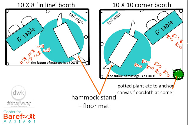
above, the overhead floor plans for each option.
my basic layout concept was to angle the table and hammock frame to create more open space for people to move around and view the demos. it works in an in-line booth, even though space is tight. the corner booth is always more spacious (even with the same measurements) because it allows for two points of entry / exit AND viewing space for the demos. while fixtures (table, hammock) are still angled, the extra 'outside' space is factored in. (meaning you can 'spill' into the aisle space a BIT)
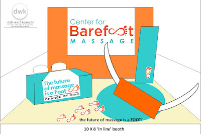
below, the floor plans rendered in perspective views - from the front:
while both of these may look the same to you, they aren't.
the corner booth (bottom image) includes the addition of a potted plant or other medium-sixed object to 'anchor' the corner of the booth. why? it's a safety precaution. it keeps people from cutting that corner as they walk the aisles -preventing them interfering with the demo work being done and in this case, from tripping on the floor covering.
my design concept included covering the multi-color carpeting in the hall with a large 12X12 beige canvas painter's tarp. why? it's all about color. the white draping separating this booth from it's neighbor neutralizes surroundings and helps put the focus on the signage, color, and action going on in THIS booth. by neutralizing the floor with another light color, we keep the focus on those things and not a dark, busy pattern on the floor - important because the demo work being done is on floor level.
an unexpected benefit to the canvas floor covering was that the team was able to walk around barefoot on it and their feet stayed very clean - which is imperative when you are massaging with your feet!
to further focus eyes on the demo work being done, i specified that a large circle - another element of the logo seen in their marketing - be cut from fabric or painted onto the canvas tarp under the hammock frame.
i designed it as aqua, but my daughter has magic tricks of her own: when she couldn't find the right color of aqua paint or fabric, she used an orange fabric round tablecloth that matched the square one on the backdrop.
this repeated use of the orange from the back wall onto the floor reflects the practice of 'color spotting' - leading the eye with color. you see the color at eye level, follow the color to the next place it appears, and you focus on exactly what the business WANTS you to.
in my renderings you can see some text and little orange 'feet' graphics on the floor. those were going to be hand-drawn on site, but there just wasn't enough time - they were a very small detail, so their absence doesn't change the visual impact.
the aqua blue hue appears in the tall flag signage placed on the aisle for more visibility, fabric covering the six foot table, accented with banners with more logo presence, and the bolsters and pillows used during massage demonstrations.
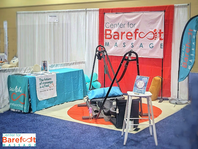
during setup on Thursday, the team had to make some adjustments to placement of the hammock frame and table, in order to have enough space to work. they determined the most impactful way to place the hammock frame to show off the moves of their modality and equipment to onlookers - with it in this position, the practitioner is facing the open sides of the booth while in action.
with the hammock frame in this position, having an 'anchor' at that corner point becomes a safety issue - you don't want people running into the metal frame. the tall barstool placed here is far more visible than a low plant would be - plus it serves as a small table to hold informational brochures.
that placement required the large table to be placed parallel to the inner side of the booth. you see that reflected in the photo above, and it worked perfectly for them - the front end of the table held informative literature easily accessed by attendees.
working with a client to provide a visual concept and basic design guidelines is only part of the collaboration. my goal is to EMPOWER my clients, enabling them to make more detailed decisions as they progress AND to understand the concepts of successful, effective visual presentation that they can use to make on-the-spot decisions and adjustments.
note that all of the signage, handouts, information sheets, props and materials used are ALL reflective of the brand color palette. this keeps the look clean, un-busy, and impactful - focusing all attention on the demos. as seen in the photo below, the team all wore clothing that repped the brand, too!
that's a top tip for trade show booths: dress to reflect your brand so that customers can FIND you in the booth. nametags aren't enough.
that's a top tip for trade show booths: dress to reflect your brand so that customers can FIND you in the booth. nametags aren't enough.
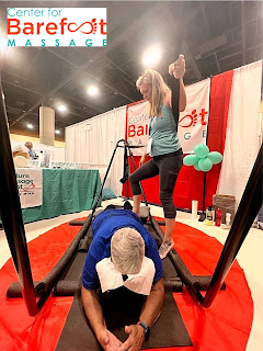
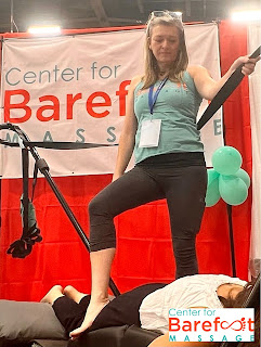
here's a great photo showing Jeni in the booth doing a demo of the myofascial ashiatsu barefoot massage work she is famous (literally) for. she's one of the founders | owner of CBM, and invented that big strap you see her using, as well as developing and writing the instructional curriculum used by the CBM team.
that strap is why the hammock frame was a factor - it's supporting her, providing leverage for the lateral/diagonal approach to muscle and fascia massage. the weight of the client plus weighted mats on the floor hold the hammock frame in place and counterbalance Jeni's weight as she moves. Jeni worked with a welder to create a frame that was sturdy and strong and would disassemble for packing up and traveling via plane to the conference. another great idea borne out of constrictive parameters!
in their massage studios, practitioners have permanent bars mounted to the ceiling above massage tables to use as weight-bearing support and leverage as they work - the strap attaches to those poles and functions as it does on this portable frame. (they also have portable overhead bars designed by another team member, but those were too heavy to put on a plane for this trip)
the other 'equipment' you see in the photo above is for matwork in a style based on Fijian massage, done on floor level, demonstrated by other team members.
that's Jeni again, showing a constant large crowd of curious onlookers exactly what CBM means by 'ashiatsu barefoot massage'. it isn't a footrub!!!! this is deep, effective myofascial ashiatsu massage work that promotes healing and health - that just happens to be done with the practitioner's FEET.
the Center for Barefoot Massage is a team of massage practitioners based all across the USA with their own active massage businesses, who are all instructors in these new and growing modalities. their students have massage businesses all around the world.
for the conference attendees (especially those who are new to the industry), these demos were a mind-blowing invitation to advance their own education: using your body weight and strong leg muscles to massage is much more sustainable than using only your hands, arms, and shoulder strength. these modalities can extend a practitioner's career by decades. and no one trains therapists more professionally in this modality than CBM.
(see? i DO understand her biz! and it's the best massage in the worrrrrld, trust me.)
Jeni posted on the CBM blog about the conference and all that went into their appearance there - read her post here. you can see her time-lapse video of the booth setup in that post, too!
visit the CBM website for even more info on this exciting massage modality, learn more about Jeni's professional experience and qualifications here
________________________________________________want to see more space | booth design info + inspo?
check out these links to related content:
how brand image drives booth design
booth displays,show booth design,show booths,display tips,brand image,entrepreneurs,Gift Show,redesign,retail store design,showroom makeover,space design,store design,





Love you , mom! Thank you for your help and insight: we definitely were the only booth with a floor concept, and the DIY easiness of all your ideas made it completely do-able. If I weren't such a worry-wart, we could have gathered a lot of the supplies locally (which you did help us source and find in Phoenix, but my neurotic hot-mess brain made me find it at home locally, pack it all in a checked suitcase and fearlessly, guilt free chuck it in the trash at the end of the show!!)
ReplyDeletePs: I had to tell virtually EVERY visitor to our booth that the rack wasn't for sale, because that's so much of what their eye was drawn to. They thought we were selling the strap rack hammock thing, until we drew their attention to the footwork and strap. (Shoulda wore teal and reddish orange toe socks to grab more eyeballs on our feets!!)
thank you so much, Jeni! you know i always love werkin' with you, and i'm glad you proofed my article to make sure i got the modality terminology and verbiage correct! (yay me!!!!) and i LOVE your idea for adding colorful toes sox to your wardrobe for the next convention.
Delete