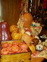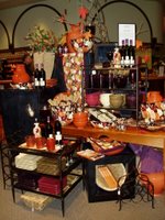
If there is one word that expresses the mood of Autumn, it is 'Harvest'.
And that leads to Abundance - a very important concept in retail visual merchandising.
Your goal is to attract your customer's eye with a display that is full of product.
Product to discover, to look at, to investigate, and to purchase. (Don't forget your signage!!!)The best displays have a 'lifestyle' or 'feature' area, where a grouping of products creates a mood, a theme, etc. An adjacent table or shelf unit holds LOTS of those products - all neatly corralled or lined up, easy for a customer to grab n' go. (Like in the Taco Bell commercials - "You're GOOD TO GO!"!) It is very important that both the 'feature' area AND the 'stock' area are always filled with product. Neat, clean, but FULL. If you have a low amount of the items and can't fill it up, you need to build a smaller display and get a smaller fixture to put the stock on. Or you need to bring in some additional products, and cross-merchandise it into your theme.

This concept can apply to a robust, voluptuous old-world style display, as shown in the photo at top, or in a sleek, contemporary display, as shown in the photo above. It matters not whether you build it in a geometric grid form or a freeflowing arc. It matters not whether the fabric is draped in great swaths across the table, or hung vertically from above. Any display of product, any theme, any style, in any store will benefit from having additional product easily available immediately adjacent to it.
I mean, I just loooove creating those lifestyle tableaux of spilling items and draped fabrics and artfully placed floral accents. I really do. It's like a still life painting come to life. (Which, I know, kind of negates the term 'still life'...but anyway....) But the most glorious, opulent display won't sell your products on it's own. It needs to be partnered with accessibility. Because very few people will reach into what looks to be a 'perfect' display and take an item. I think they have flashbacks to when their mommies took them into stores, and held their hands and said "Don't Touch Anything!", I really do. They just don't want to mess it up. Even if they really, really want that item. So make it easy for them...and for your sales staff. The bonus is, it's also MUCH easier to re-stock products in this format.
One final note: There is a retail science concept that goes something like this: "Make them think that there is a very limited supply of something, and they'll be inclined to purchase it NOW instead of thinking 'There are so many, there is no hurry. I'll come back for it later'." You are basically presenting merchandise with the idea that it is a 'limited offer'. And in some cases, this is exactly what you should do. Don't put out two dozen of THE hot item...ahem, THX Elmo!...put out six. Your customers will not think twice, they will grab n' go. They don't want to lose out.
An abundance of product, ideas, and inspiration will reap you a harvest of benefits this season....
(Photos copyright DWK 2006, courtesy of Columbia Winery)

No comments:
Post a Comment