Showing posts with label artful makeovers. Show all posts

2.20.2026

Art Show Booth Concept Design

..

I recently had the joy of assisting Leah Nadeau, a contemporary artist based in Portland, Oregon, in making a huge leap forward in her career by helping her to design and set up her booth display at the renowned Palm Springs Modernism Show. 

(Yes, I AM still retired! The fact that I am not publicly marketing my services any longer doesn't keep me from stepping up occasionally to assist creatives and small business owners by using the skills that I have honed over more than half a century.)  When this talented artist posted on Instagram that she was in need of help at this show in my area, I volunteered. She graciously accepted - enthusiastically! And together, we created a concept and a plan, then put that plan into action as we met at the Palm Springs Convention Center on setup day before the show opened.

Let me share the design-to-installation process with you, along with some 'adventures' that were had along the way...


Design always begins with a goal.
While any activity involving the purchase of goods has an obvious goal (sales), in this case the main goal was to present the artist's artwork in the best way possible - in a way that reflected not just the style of her art, but what inspires her, what she communicates via her art, and how she wants the viewer to experience her art.  

In addition, this artist did this show to expand the exposure of her art, reaching new clients for the art on display in the booth and to reach more clients who desire custom commissioned work. This meant that her art displayed in her booth had to communicate in various ways to various groups of people... and this show attracts more than 15 thousand people over three days every February, and her efforts would be seen by all of them!

For those who came to purchase art during the show, there needed to be a variety of sizes, color palettes, and types of art available - from canvas & framing options to pricing levels, there had to be choices that would appeal to a span of potential buyers.

For those who came to the show to discover new artists with the goal of having custom commissioned work done later, her display needed to show some variety to grab their interest - and she prepared a GORGEOUS catalog with imagery and information about her commission process. It was one of the best pieces of marketing material that I have EVER seen. One of her friends helped her create it - and that's why we say 'It takes a tribe' to succeed. 

Another aspect of her presence at the show was to gather new contacts for her mailing list and to lead people to her website - where she sells more than just original paintings. She offers glassware, textiles, home & gift goods, and seasonal decor elements featuring her art online, but those weren't allowed to be sold at this show. She brought a few of those items and we used them as 'props' on the table in her booth.

You can see how multi-faceted the design for the booth needed to be to meet these criteria. With those parameters and goals in place, the design process began...

11.08.2017

artful makeover published!

a while back, I worked with professional artist Sharyn Sowell
to redesign and restyle her studio... an Artful Makeover.
we spent a week up in Washington state plotting, planning, 
dreaming, sketching, shopping, painting, arranging, and laughing...
and the result was a studio space that not only had more storage and more working space, 
but worked more efficiently for her 
AND was the inspiring nest she had always hoped for.

you can read all about our process and see photos in this Artful Makeover post.

Sharyn's studio and her art are featured in the new Winter issue of Where Women Create Magazine
and there's a nice little blurb in there about yours truly, too!

it's always fun to help another creative person create the space they dream of....

if your creativity is being overwhelmed by your workspace, 

10.30.2017

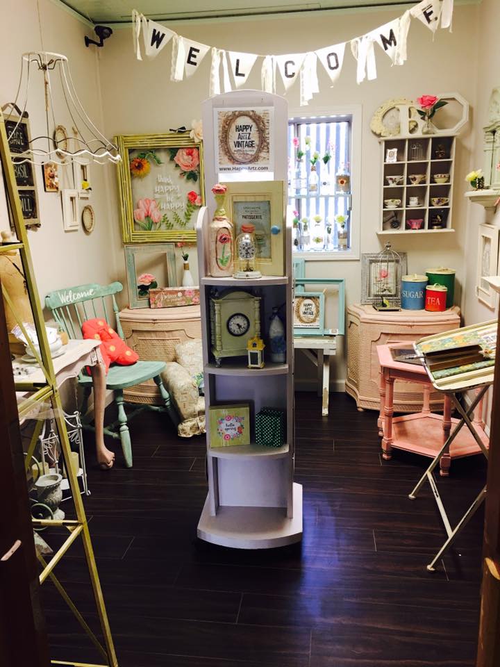
Vintage Vendor Space Makeover

BEFORE

Let's talk about vendor booths in stores. 
Vintage, antique, handmade - doesn't matter what they sell,
they have to deal with limitations of space and lighting in every situation.

I recently had the opportunity to make over a vendor booth, 
so I thought I'd share the process...
The photo above shows you an 8' X 10' room inside a multi-vendor store.
That vendor moved to a larger room, and a new vendor took over the space...
(I'm showing you this shot so you can see the huge difference as the space progresses)

Once Vendor 1 moved out, the room looked like the top row of images in the photo below: 
empty. and filled with blue light, most of it from the overhead florescent fixture. 

The challenges here: 
counteract the blue light. warm it up.
make the space seem larger. infuse some personality into the room to help tell a story. 

oh - and it all has to be removable, non-permanent, and CHEAP. 

sure, I can do that ;) 
 In the center of that photo, you'll see the 'DURING' segment.
,
In this phase, I brought in wall and window treatments that accomplished the main goals:
Warm up the space - the aged, yellow-gold tones of the vintage book pages & sheet music
help to counteract the blue-white walls and blue light present in the room.
To overcome that florescent fixture, I covered it with yellowed piano player music rolls.
The light is now MUCH warmer, without making a change to the bulbs.

Below, you can see details of the wall treatments that I created...

On the left below, which is actually the wall on the right as you enter the room,
I created panels of pages by gluing them onto simple posterboard sheets.
This made installation quick, easy, and possible for one person to handle alone (that would be ME)
and it also makes this effect easy to remove when the time comes.
I was able to create the panels in my studio beforehand, saving me time and money
over having to apply pages and pages directly to the wall.

On the right below, which is the wall on the left as you enter the room!, 
is a collage 'art piece' made up of a few more posterboard panels, an old projection screen,
player piano music rolls, and miscellaneous items like boxes, hooks, and books.


 The photo above shows a larger view of the left wall 'art collage',
which was created to utilize vertical wall space for the display of jewelry and wall art.
The hooks, boxes, and even folded pages of books will hold merchandise
well within reach of customers. Plus it's really unique and eye-catching!

The window, shown in the photo below, was partially covered with a 'valance' 
made out of piano player music rolls hung from a simple curtain rod.
The panels help to diffuse the blue light coming in (and keep you from seeing the metal security bars outside).

You can also see that I treated the funky shutters on the wall as a 'window',
adding a canvas' awning' above it from two curtain rods and a set of brackets.
(Eventually, when we find a mirror that fits the hole in the wall behind those shutters,
we'll install it and open up the shutters to enhance the 'window' effect - 
and the mirror will bounce more light around the room.)
Once the 'backdrop' was in place, I brought in some basic table fixtures to hold merchandise - 
a long, narrow table on the longest wall and a round tall table to the left inside the door.
The rocking chair, wood ladder holding the sign, and mannequin (under the coat) are funky props
that add interest and will hold a plethora of products.
This approach utilized the narrow space efficiently, and make it seem larger.

Then the merchandise was loaded in,
filling the tables, art collage wall, mannequin, window, and rocking chair with treasures
both vintage and handmade. That brings us to the 'AFTER' part of the photo.
(NOTE: this is not the same vendor that occupied this room in the top 'before' photo)

Now I'd like you to scroll back up to the first photo I shared.... it's ok, I'll wait!
Look at that room, and then scroll back down here and look at THIS room.
Both photos of the room were taken from exactly the same vantage point.
They don't even look like the same room, do they? 

The lower one seems to be wider, not quite so tall and skinny, and clearly warmer.
You can't see everything offered in one glance... things are hidden.
The room welcomes you in. It invites you to browse and discover what's offered,
 and take a bit of this mood home with you.

THAT, my friends, is why visual details count
It's all an illusion. And it can work in your favor.

Need help with YOUR space? Shoot me an email!

10.10.2016

Sharyn's Artful Makeover

Over the summer I worked with professional artist Sharyn Sowell
to completely re-design her art studio.
It was a fun (and exhausting!) whirlwind week of work,
where I was able to teach Sharyn some tricks of space design
and organizational concepts that really freed up her space and time in the long run.

we started by emptying her studio and leaving only furniture & fixtures...

 we evaluated what worked, what didn't, and what was needed
for her studio to express her brand image and work more efficiently for her.
then we painted the walls new vibrant colors to warm up the space.

and then we went SHOPPING!


 we hit the local thrift shops, a friend's house, a local salvage yard, 
and even found a pile of old drawers on the side of the road! 
we went to a local vintage market and found the red paper rack, 
and found a galvanized metal cart at a local shop.

 after some painting and cleaning, the new furniture went into the studio
- along with some of the old furniture in new locations! -

and we created 'zones' for the different activities that Sharyn undertakes in her studio.

supplies were loaded into each zone -
some stored in an old locker, some in the drawers we found, some in crates, 
and then there's that killer stack of suitcases hiding all kinds of creative goodies!
THEN the really fun part started: the decorating!

my goal for Sharyn was to get her art OUT of those flat files and onto the walls!
she had years and years worth of beautiful work hidden away, 

so I pulled it out and put it all over the studio...

from little vignettes on windowsills and shelves

  to small wall collages above the flat files (featuring her art plus 3-D objects)
 to the HUGE collage mural that I created near her beloved printing press:
the background is made up of huge posters of Sharyn's art,
formerly used at gift & stationery trade shows.
over that, I layered some original pieces from her files,
along with cutouts and 3-D objects  like tissue paper flowers, vintage millinery & jewelry.
it's a visual reference of all of the many styles that Sharyn loves
and has brought to life over the many years of her professional career.

{ i did the large collage while she was in the house, and when she came back out, 

she literally gasped. i've never been so thrilled by a client's reaction! }

this 'phase one' of the project set into motion a creative flood of ideas
and Sharyn continued refining the space more and more after I left.
she's happy with the changes and the way her creative space functions now,
and I'm thrilled that I was able to help her see the possibilities!

Sharyn is sharing the process and her own photos over on her studio blog:
artful makeover part 1 and artful makeover part 2

photos by Debi Ward Kennedy + Sharyn Sowell

UPDATE:
Sharyn's studio makeover appeared in a story in the Winter issue of Where Women Create Magazine, in November, 2017!

from retail stores and show booths to art studios and classrooms! 


8.31.2016

Wall Display Inspiration: Wood Crates

As I've been rounding up old wood crates to use in a display I am working on,
a display that I created years ago has been on my mind...
and it's something that can be easily replicated in your store or show booth.

You're not going to believe where this story starts....


 This is a 'before' photo of the wall I decorated.
Actually, this is the second photo, because it started out blood RED.
As soon as I could, I painted the entire barn interior WHITE.

Um, yeah, you read that right.... this was inside a horse barn!
A small 2-stall barn on a farm was remodeled into a seasonal store.
After the cleanup and paint, lights were added
[bought at the ReStore for $3 each!]
and the french doors on the left were installed on the inner wall
so that the huge barn door could still slide open & closed on the outer wall.

 So then I decided to add some interest to that big white wall...
and I 'wallpapered' it with strips of vintage piano player music!
[I had a box of fifty rolls, so there was a LOT to work with.]
After the wall was covered, I added extra pieces that curled up and out, to give it texture.
I even hung some of the strips of paper with the roller dowel still attached,
and some from the rafters up above to make the wall seem even taller.

 Then I took a collection of miscellaneous wood crates and boxes
and screwed them to the wall in a free-form configuration.
I didn't measure - I just started at the bottom with the biggest crates, and worked my way up the wall.

I liked it when it was empty, but the whole point was to create areas for product to be displayed...


... and I crammed a LOT of small items into those boxes!
Furnishings and lamps and other accessories were grouped in front of the wall, 
and the whole room came together in a very organic, country, almost 'Anthropologie' display.

I say 'room' but really, it was still just a barn stall!
[that french door you see was set on the inside of the opening, 
and the dutch barn door opened out]
It was a really enchanting setting, partially due to the unique display sets.

There are so many ways to use this idea in retail settings:

Peggy at Down Home Country Antiques in Orange, California 
created a great wall arrangement of crates for her fall season displays.

Roger's Gardens Nursery in Newport Beach, California 
created an outdoor wall treatment to hold a changing display 
of seasonal garden supplies and plants.

An arrangement of wire locker & freezer baskets would have a more industrial vibe.
If you have a kids' store, hanging brightly-colored plastic milk crates would be perfect!


7.31.2016

On Creativity...


This is so true, no matter what it is that you do as creative work.

And it is also true that many people never hear this information... 
they just toil away in silence, hoping and wishing for 'a break' to come. 
Scribbling and drawing, doodling and writing, scratching out sentences and paragraphs.
First drafts become fiftieth drafts... 
and the struggle to reach their lofty visions goes on.

This is how it IS, and how it is SUPPOSED to be. 

Those stories of 'overnight successes' are bunk.
Celebrity can come in an instant - and the instant is often quickly over. 
The phrase 'Fifteen minutes of fame' doesn't lie. 
[Though, admittedly, many celebs outlive that fifteen minutes somehow].

Creativity is a commitment to a pursuit.
You have a dream, a goal, a vision.
You work toward it every day

Maybe you can only squeeze in five minutes a day to be creative.
Great!
Snap a photo. Write a sentence. Sketch a scene. Flesh out an idea.
It builds your skills, your ability, your 'eye', your vision - exponentially.
Much like accrued interest on a savings account, 
this kind of devotion to the practice of a craft, an art, a creative work,
is what compounds daily and increases the value.
You just keep getting better at it the more you do it.

[Have you heard about the principle of Ten Thousand Hours?]

Just keep working.
[paraphrasing Dory there...]
Keep writing, or drawing, or snapping photos.
Whatever it is that you create, keep creating it.
And forget the 'published' or 'exhibited' credits...
Even if no one ever sees the work, it's building your vision.

It doesn't matter how long it takes.
One day, you will look at your own work
and smile 
and say out loud to yourself,

"Hey, I'm GOOD at this!"
(now get ready for your moment and cue the paparazzi)
________________________________________

art·ful
ˈärtfəl/
adjective
  1. 1.
    (of a person or action) clever or skillful, typically in a crafty or cunning way.
    "her artful wiles"
  2. 2.
    showing creative skill or taste.
    "an artful photograph of a striking woman"
    synonyms:skillfulcleveradeptadroitskilledexpert
    "artful precision"
.

credits: original quote by Ira Glass . graphic image (top of post) by Sawyer Hollenshead