Showing posts with label brand image. Show all posts

1.14.2026

Five Ways to Increase Your Brand's Visual Impact

retail display,retail fixtures,retail visual merchandising,retail store design,retail tips,brand image,business 101,business tips,display ideas,display tips,store design,women in business,
People always ask me how to create fabulous displays...
but the truth is, your visual impact as a business
starts BEFORE you ever put products in your store.

When I work with clients to design their retail environments and displays,
I start with this principle: ‘Tell Your Own Story’ in all visual communications.

Make your brand a consistent expression of your business’ individual mission, purpose, style, and products or services – and then leverage that brand by using it in every visual medium at your disposal. This is the main opportunity for you to show your potential customers why YOU are different than others – be proud of your individuality and build on it.

Let me explain that concept this way: Have you ever tasted a Cabernet wine?

If you were to taste one each from Walla Walla, Yakima, Horse Heaven Hills, Indian Wells – all regions in the Eastern half of Washington state – you’d find that not all Cabernets are created equally. The vineyards each have distinct variations in soil content, rainfall, sun exposure, and other conditions, which cause the vines to grow grapes that have vastly different sugar and acid levels, affecting their taste (‘palate’). When harvested and fermented, those variances result in wine that is unique to that grape varietal in that particular location – a Cabernet from Walla Walla is not like a Cabernet from Yakima, or Italy, or France, or Napa, or anywhere else. Your business is not like any other – no matter what you sell, you’re unique because of all of the distinct variations and characteristics that make up your business.

In the wine industry, this concept is called ’Terrior’ (Tehr WAH) – loosely translated, it means ‘Pride of Place’. Or, ‘I’m a proud product of where I come from’. Wineries utilize this concept in the marketing and positioning of their businesses within the industry and to the consumer, by capitalizing on the uniqueness of their terrior. They combine their location, history, resources, processes, mission, and ultimately their product, to create a brand identity that Tells Their Own Story. It’s much the same concept as selling designer jeans or mineral makeup or floral design services – your competition is selling the same basic thing, and it’s your brand image that talks. Be a proud product of ‘where you come from’!

continue reading for steps you can take to implement this information...

1.07.2026

Trade Show Booth Concept Design

booth displays,show booth design,show booths,display tips,brand image,entrepreneurs,Gift Show,redesign,retail store design,showroom makeover,space design,store design,trade show booth design
here's a look at something you haven't seen much of on my design blog: the design concepts i create for NON-retail spaces.

i've shared a few trade show booth shots before, including the display setups i've created for wholesale gift shows in the USA. i've also shared the redesign i undertook with my daughter in her 'Heeling Sole' barefoot massage studio in Texas several years ago. (i'll link all of those posts at the end of this one)

when you combine those two things, you see Deb designing a trade show booth concept for her daughter to set up at the national convention of her industry...

i'd like to share the project with you with the goal 
of helping you prepare for any trade show, convention, even pop-up space that your business might have as you promote what you do.

continue reading for my narrative and Jeni's input on our process and how those goals were met...

6.01.2024

Summer Display Switch-Up!

I'd like to revisit an archived post, to show you how making a fast, simple but large-scale change
can make an incredible impact in your retail displays for the summer season...
Come with me on a lil' trip into the past!
 I created displays for Columbia Winery in Washington state for six years. Here's the 'logo' wall made of faux tumbled marble tiles in the front entry of the shop, filled with spring merchandise.When it came time to install the new summer displays one year, we had a bit of a dilemma: The summer merchandise is very contemporary, and in colors of white, silver, and blues. With that warm-tone, old-world style tile mural, we had some serious clashing going on that did nothing at all for the product.
I needed a solution.
Enter two very large mirrors that I had on hand, purchased for decor at a previous Auction of Washington Wines Winemaker Dinner. I decided to use those mirrors to cover up the tile. (IKEA, $135. each). I had my design assistant Karen help me heft them up onto the table, then I wired them to the sidewalls. There was still some tile showing, so I hung a white drapery panel on the side. In front of that went one of the two driftwood trellises that I purchased last year as summer props. On the top, to camouflage about six inches of tile, I hung white shutters at an angle - very 'Tommy Bahama'. Other shutters went beneath the table to lighten up the shadowed area a bit.

The result?
It was shockingly different from the previous look, and got a LOT of positive comments!
The mirror not only reflected the natural light coming in the windowed front doors straight across from it,
but it also bounced light from the overhead trac fixtures right down onto the glass merchandise.
Here's a shot of the entire main display, including the forward area with wine feature.
The tables are made from driftwood, and are for sale. Those driftwood trellises weren't for sale. The white chair was mine, and also was not for sale, just a prop. (That I fished out of a dumpster - really!)

It took maybe half an hour to install the mirrors, curtain, shutters, and props for that front display.
  Well worth it, wouldn't you say?

Now, think about what you might be able to do in your retail space....
with some old doors, or a section of cedar fencing, or maybe even salvaged rusty corrugated tin roofing.
The possibilities are endless, 
and the impact of a big change could be just what you need for the summer season.

Now.....where are my sunglasses? I'm heading for the beach......

this content originally appeared here on DWK visual merchandising blog in 2007.
photos mine, copyright reserved. 


1.20.2023

Have 'Leftovers' for Valentine's Day!


Restyling old products to create a new look - taking something and making it look totally different by combining it with something else, using a different color to set it off, etc. - is something I really enjoy. And it's an effective way to lengthen the 'shelf life' of merchandise instead of just putting it on clearance. Keep those profit margins UP, that's the goal.

...continue reading for some of my top tips for 're-using' and re-theming merch!

1.08.2022

Winter Display with Brand Style

winter displays,retail display,display ideas,seasonal display,brand image,winter,display tips,
Retail display is as much about telling your brand story as it is selling products...

This is a January display in the front of a winery gift shop
[one of several where I provided visual merchandising + retail design services]
 
It's a perfect mix for this 'bridge' season of late winter - early spring. 
Better yet, it starts inspiring customers the MOMENT they walk in,
enticing them with wonderful products beautifully presented
to enhance their enjoyment of wine, food, entertaining, and fine living. 

This area of the shop, straight in front of the entry doors,
served as a statement of who the business IS and what they offer their customer
 -
and THAT is branding 101.

I loved this area and coming up with seasonal themes for it - 
it's the first thing you saw when you walk into the winery. 
Because of the location, it was dramatic. So we always went BIG here.

In this winter display, we integrated large-scale props reflecting nature outside:
winter displays,retail display,display ideas,seasonal display,brand image,winter,display tips,
Product features are most importantly the wine with the newly designed label,
along with sculptural pieces of Vietri pottery in white ceramic, 
gorgeous brown linens, whimsical dotted glassware,
large rusty planters used as pedestals, and furniture made of branch-shaped metal + raw wood.

Props are HUGE moss-covered tree branches paired with fake ferns and florals
that reflect the natural theme of the products. 

 Lest you think that it's all about going big, here's proof that even small details matter:
winter displays,retail display,display ideas,seasonal display,brand image,winter,display tips,
More Vietri from the front display, this time a cake pedestal. 
My assistant for the day, my daughter Anni took one look at it and said "It needs a cake!"
- but we did not have a cake.
She went to work with a few stacked nested baskets and napkins,
quickly creating this confection as a perfect finishing touch. 
that inspired customers to purchase every last cake pedestal in the display!

 Tell Your Story Visually, because no one else can do it like you can... 

winter displays,retail display,display ideas,seasonal display,brand image,winter,display tips,

6.29.2017

Scrumptious Summertime Displays!

It's summertime, and it's HOT.
Especially in Las Vegas, where I happened upon this sweet shop inside a resort hotel...
the yumminess visible in the window displays and that ice cream cart at the entrance
had me salivating on first sight.

One look at the happy pastel color palette and focused lighting in these tasty window displays,
and I was heading in the door...
Once inside, and past the ice cream cart at the door,
there were more bright, happy displays on fixtures that really make the products the star.
The space was arranged so well, leaving plenty of room for shopping and lines.
And I am quite certain that there ARE lines here.... it's in a very busy area.
When you get up close to the displays, you see the perfect details of each little treat:
... and I love the way they use 'product appropriate' props, 
like dessert pedestals and cutting boards and cookie jars!

The signage  - at the entry door, on the cash wrap, and in displays - is crisp, clear, and cute:
So here's the kicker, friends.....
IT'S SOAP!
Yes, every last deliciously beautiful treat in these photos is SOAP.
They smell as good as they look, too!

Their 'About Us' website page perfectly describes them: (read it, it's AWESOME)

 Nectar Bath Treats strives to create extraordinary products and fun customer experiences.

We take great pleasure in seeing people’s face when seeing our soap

confections for the very first time. The childlike whimsy and surprise of

experiencing a slice of cake that looks and smells like the real thing, 

but is, in fact, a bath & body treat inspires and motivates us to create

exceptionally charming products.

Mission Accomplished!
From branding to visuals to appealing to a wide scope of shoppers in their location,
to providing an island in the center of the store with sinks - so you can TRY the soaps -
there isn't a single thing I'd change. Even the staff was sweet and bubbly - PERFECTION!
.
This is what you expect to see in a bake shop,
(and honestly if a bake shop looks like this, I applaud them!)
but to see it in a SOAP STORE is astounding. Brilliant concept, through and through.
This company took soap outta' the bathroom and put it in the kitchen 
to make potential customers stop in their tracks  -and to tell their story.

So what's YOUR product? 
How can you create a visual concept and apply it 
 so that your store or booth or website stands out from everyone else doing what you do?

Need help? Let's Talk Shop! email me 
on Amazon and on the Nectar website
(which looks as yummy as their stores, btw)


6.19.2017

Hey, Vendors - What's Your Sign?

I have a pet peeve when it comes to the vintage world...
It affects me when I am photographing a show.
It affects me when I am looking for a particular booth.
I see it affecting customers as they shop, and I wonder how many vendors / curators DON'T see it.

But then.... my pet peeve is something that ISN'T seen:
It's missing signage.

Sadly, the lack of a sign in a booth is a very common mistake.
At every show I attend (and that's a LOT), I see several booths without signage.
In photos shared on social media - by shows and even the vendors themselves! - I see it every day.
There have been times I'd love to have contacted the vendor who created such a lovely display, 
but I have no idea who it IS  - because they didn't make a sign with their name on it for their booth.

To quote Nancy Kerrigan, WHYYYYYYYYYYYYYYYYYYYY???
Why on Earth would anyone go to all of the trouble of having a booth in a show
and then NOT put their name on a sign in that booth?!
It defies logic. 

Especially when there are more easy ways to create a sign than I can count.
There are difficult ways, too, and that's fine... just make one, for heavens' sake!
Put that baby on your booth wall, hang it from your pop up, stick it on the front of your cash stand!

Here are some incredibly amazing signs that I saw on my recent trip to 
where some of the best vendors / curators in the vintage biz show off their stuff.
Yes, there are still people there who didn't have signs....
but THIS is how the PROs do it: 
Though all of the signs above are neutral in color, they have incredible visual impact.
From scale and lighting, to unique materials and simple construction,
you NOTICE the name of the vendor/curator in the booth as soon as you look at it.

Details:
Lisa Souers gathered up all kinds of letters and mounted them to old boards.
Junk Hunks revived marquee letters and lit them with patio lights.
Farm Salvation and FOUND painted on old glass windows.
Storehouse Goods painted on a rusty old windmill part.
Home Sweet Home painted on simple chalkboard panels.
Atelier de Campagne had a scrap of metal laser-cut.
The signs in this image all have color in common, running the gamut of the rainbow
while also presenting the brand of the business in visual form. 
As individual as the people who made them, they speak before customers are even IN the booth.

Details:
The Urban Gardener simply painted her biz name over a thrifted framed painting.
American Country Charm ironed letters onto children's denim overalls.
Marigold Vintage used a children's chalkboard.
Apron Strings used a cabinet door. Unexpected Necessities used a headboard.
This Old House painted on old wood planks.
Tailfeathers used blocks painted with letters, topped with birds.


This is basic marketing, folks... just like biz cards and social media accounts,
you need signage in your booth at a show, and in a store. 
Help customers find & remember you!
Help show hosts, photographers, writers promote you through sharing!

So.... to recap, you can use these items to make a sign:
framed paintings . chalkboards . children's clothing items . cutout wood letters . old wood boards
headboards . cabinet doors . old windows . old window screens . an old windmill tail
laser-cut metal scraps . salvaged sign lettering . salvaged marquee letters . salvaged ANYTHING
fabric . paper . posterboard . cardboard . paint . stickers . felt pens . pencils . crayons

here's some of the signage I created for my past vintage business:
 small signs on the cash counter and on the register    .   a flag flying over the booth
 a headboard made into a sign, attached to the fence outside my barn where my shows were held
decals applied to canvas panels that created sides of the booth
a painted kitchen cabinet door that hung from the tent frame
It wasn't hard to make those signs, and I used them for years.

Do YOU have a clever, creative sign for your vintage business?
Share a photo of it on my facebook page!

6.14.2017

Farm Chicks, a Dollhouse, and Branding

In another chapter of my life story, I was a vendor at vintage shows.
The largest and most well-known show that I participated in was the Farm Chicks
a show with hundreds of vendors held every June in Spokane, Washington...
and a fanatical customer base of thousands of people who'd come across country to shop the show!

I was a Farm Chicks show vendor from 2007 to 2011
and I filmed my six-episode video series there in 2007. 
But I've never been to the show as a SHOPPER... until this year!
It was amazing... it's always amazing! 
There are many reasons why it's called 'The Happiest Show on Earth'!
I loved seeing my friends who are still vendors/curators.
I found a few special things to bring home, and snapped a LOT of photos.

But before I share the beauty of it all,
I wanna' share the BIZNEZ of it all.


Because founder and proprietor Serena Thompson is a branding WHIZ
and I know you can learn a lot from her... 

Every year, Serena selects a theme for the show. This year, it was 'Home Sweet Home'.
The centerpiece of her theme was the imagery of a dollhouse... 
and you can read what it was that inspired her here on the Farm Chicks blog
Serena also selects a color palette - and it's repeated in all of the elements she uses.

For example - the logo and all marketing collateral:
From the postcards to the vendor & guest badges to the show map
and even a photo frame for guests to use on social media, it ALL coordinates.

At every show, the main entrance features a HUGE display that reflects the theme...
I'm gonna' be honest here and say that I expected some big boxes,
assembled and decorated to bring that dollhouse artwork to life.
But nooooooooo, Serena surprised me with her eyepopping creation of BAKERY BOXES!
Read this post on her Farm Chicks blog to find out what inspired her
On the bottom right, you can see the Farm Chicks booth in the entry atrium.
The backdrop of that booth echoes the 'cross stitch sampler' lettering,
and the tables are draped in pastel quilts as they await final merchandise placement.
All of this reflects the qualities of a 'Home Sweet Home' and a dollhouse.

Vendors like the girls at Marigold Vintage and Unexpected Necessities
get into the spirit of the theme, too,
 by incorporating it into their wardrobes, booth displays and products:

The logo merchandise is thoughtfully coordinated with the color scheme, 
and displayed on the quilt-topped tables in groupings prettied up with simple props:
a few pieces of pastel-painted furniture, bright pastel tissue paper, and more
bring the small-scale coffee mug, flat fabric tees and canvas tote bags to life.
The attention to detail here brings the logo to life in living color,
and tells exactly the story that Serena wanted to.
She does this EVERY show! (see more Farm Chicks Show photos here).

There's a huge staff of Farm Chicks and Farm Hunks that help out at the show, too...
hauling purchases out to customer's cars and straightening displays... all.day.long.
(and how hunky do those guys have to be to be okay with wearing PINK tees, huh?!)
I've always been impressed with the way Serena brands her show...
I even filmed one segment of my video series in the Farm Chicks booth in 2007,
and discussed branding with her and Teri Edwards, her biz partner at the time:

Like Serena says in the video, she views the show as one big product
that needs packaging to sell it... branding is IMPORTANT!
Whatever you do, Tell Your Own Story* - 
and tell it with everything visual that you use!
*I've been using this tagline since 2002. And I really mean it!

In my next post, 
I'll share photos of some of the details of successfully merchandised booths that I saw at the show,
and you can see how truly PRO vendors / curators do it!
Until then... 

4.24.2017

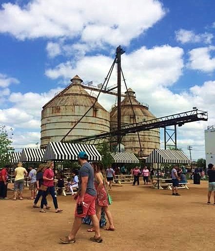
Magnolia Silos Retail, Part Deux

Okay, Y'all.... I promised you MORE photos from my recent visit
to the Magnolia Silos in Waco, Texas...... Here they are!
.
The 2-acre site was formerly an abandoned agricultural property,
then Joanna & Chip Gaines reclaimed, rehabbed, remodeled, revived, and re-branded it
into a retail village, right in the heart of downtown Waco, Texas.
They've made use of the existing structures and architecture in an appealing way...

The first thing you notice when you walk into the development is that it's BIG.
Not just the land... but everything ON it! BIG BIG BIG!
 

 As a matter of fact, it's so BIG that you need directions to find everything. 
There's a MAP for that!

Very smart, if you ask me.... you don't want to miss anything while here,
and the map (located in front of the main retail store from my last Magnolia post) makes sure that you don't.

Along with that main store, there are two other retail buildings on site
(with a third in progress - inside one of the silos!)
The Silos Bakery:

The patio area outside of the bakery is a very nice touch - and it was FULL!
I was unable to visit the inside of the bakery, 
because the line outside was two blocks long
and I wasn't going to ask my family members to wait two hours for me
to get a cupcake and snap some photos.
(but those musta' been some REALLY amazing cupcakes!)

Another building is the Garden Store:
 Signature decor touches and merchandising style reflect the aesthetic of the main store.
This area is much less busy than the main store, but has a nice selection of 
branded apparel and garden tools & accessories.
If you want to take home a Magnolia souvenir but hate waiting in long lines,
I recommend shopping in this location
;) 

Near the Garden Store, across the beds of flowers and vegetables, 
is the Garden Shed (not accessible to guests)
The garden area is decidedly less busy than the large (faux) lawn and picnic table areas,
so it's possible to sit in a willow tree chair and find a bit of silence amidst the crowds...
The facility functions as a community space, 
with room for lawn games, picnics, and stopping to smell the roses
along with - or instead of - shopping for retail treasures.
The only issue is limited parking.... on Friday & Saturday, it's gonna' be a hike.

There is ample space on the grounds for a weekly gathering of gourmet food trucks,
and the twice-yearly 'Silo-bration' event,
where the Gainses invite purveyors of handmade & vintage goods to sell to their customers.
Personally, I think that's smart - it's a way for the loyal Magnolia fans to
get their hands on authentic vintage goods along with the Silos experience - 
because the store's main offerings are 
brand new, mass-produced, home decor accessories, which are available on their website,
with a few handmade items sprinkled in.
.
All in all, I was very impressed with what the Gainses have created,
how it is true to their brand and style,
and how they have brought their tv show to life so that people can experience it in a new way.
They are 'Telling Their Own Story', so to speak... 
which is something I've been advocating in seminars, articles, and blog posts 
for over two decades now.
That's just smart business.

For more about Magnolia Marketplace, the Silos, and Fixer*Upper,
visit the Magnolia website.
.