Showing posts with label vintage paper. Show all posts

10.30.2017

Vintage Vendor Space Makeover

BEFORE

Let's talk about vendor booths in stores. 
Vintage, antique, handmade - doesn't matter what they sell,
they have to deal with limitations of space and lighting in every situation.

I recently had the opportunity to make over a vendor booth, 
so I thought I'd share the process...
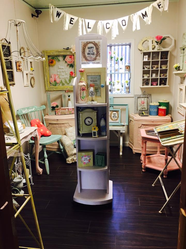
The photo above shows you an 8' X 10' room inside a multi-vendor store.
That vendor moved to a larger room, and a new vendor took over the space...
(I'm showing you this shot so you can see the huge difference as the space progresses)

Once Vendor 1 moved out, the room looked like the top row of images in the photo below: 
empty. and filled with blue light, most of it from the overhead florescent fixture. 

The challenges here: 
counteract the blue light. warm it up.
make the space seem larger. infuse some personality into the room to help tell a story. 

oh - and it all has to be removable, non-permanent, and CHEAP. 

sure, I can do that ;) 
 In the center of that photo, you'll see the 'DURING' segment.
,
In this phase, I brought in wall and window treatments that accomplished the main goals:
Warm up the space - the aged, yellow-gold tones of the vintage book pages & sheet music
help to counteract the blue-white walls and blue light present in the room.
To overcome that florescent fixture, I covered it with yellowed piano player music rolls.
The light is now MUCH warmer, without making a change to the bulbs.

Below, you can see details of the wall treatments that I created...

On the left below, which is actually the wall on the right as you enter the room,
I created panels of pages by gluing them onto simple posterboard sheets.
This made installation quick, easy, and possible for one person to handle alone (that would be ME)
and it also makes this effect easy to remove when the time comes.
I was able to create the panels in my studio beforehand, saving me time and money
over having to apply pages and pages directly to the wall.

On the right below, which is the wall on the left as you enter the room!, 
is a collage 'art piece' made up of a few more posterboard panels, an old projection screen,
player piano music rolls, and miscellaneous items like boxes, hooks, and books.


 The photo above shows a larger view of the left wall 'art collage',
which was created to utilize vertical wall space for the display of jewelry and wall art.
The hooks, boxes, and even folded pages of books will hold merchandise
well within reach of customers. Plus it's really unique and eye-catching!

The window, shown in the photo below, was partially covered with a 'valance' 
made out of piano player music rolls hung from a simple curtain rod.
The panels help to diffuse the blue light coming in (and keep you from seeing the metal security bars outside).

You can also see that I treated the funky shutters on the wall as a 'window',
adding a canvas' awning' above it from two curtain rods and a set of brackets.
(Eventually, when we find a mirror that fits the hole in the wall behind those shutters,
we'll install it and open up the shutters to enhance the 'window' effect - 
and the mirror will bounce more light around the room.)
Once the 'backdrop' was in place, I brought in some basic table fixtures to hold merchandise - 
a long, narrow table on the longest wall and a round tall table to the left inside the door.
The rocking chair, wood ladder holding the sign, and mannequin (under the coat) are funky props
that add interest and will hold a plethora of products.
This approach utilized the narrow space efficiently, and make it seem larger.

Then the merchandise was loaded in,
filling the tables, art collage wall, mannequin, window, and rocking chair with treasures
both vintage and handmade. That brings us to the 'AFTER' part of the photo.
(NOTE: this is not the same vendor that occupied this room in the top 'before' photo)

Now I'd like you to scroll back up to the first photo I shared.... it's ok, I'll wait!
Look at that room, and then scroll back down here and look at THIS room.
Both photos of the room were taken from exactly the same vantage point.
They don't even look like the same room, do they? 

The lower one seems to be wider, not quite so tall and skinny, and clearly warmer.
You can't see everything offered in one glance... things are hidden.
The room welcomes you in. It invites you to browse and discover what's offered,
 and take a bit of this mood home with you.

THAT, my friends, is why visual details count
It's all an illusion. And it can work in your favor.

Need help with YOUR space? Shoot me an email!

10.10.2016

Sharyn's Artful Makeover

Over the summer I worked with professional artist Sharyn Sowell
to completely re-design her art studio.
It was a fun (and exhausting!) whirlwind week of work,
where I was able to teach Sharyn some tricks of space design
and organizational concepts that really freed up her space and time in the long run.

we started by emptying her studio and leaving only furniture & fixtures...

 we evaluated what worked, what didn't, and what was needed
for her studio to express her brand image and work more efficiently for her.
then we painted the walls new vibrant colors to warm up the space.

and then we went SHOPPING!


 we hit the local thrift shops, a friend's house, a local salvage yard, 
and even found a pile of old drawers on the side of the road! 
we went to a local vintage market and found the red paper rack, 
and found a galvanized metal cart at a local shop.

 after some painting and cleaning, the new furniture went into the studio
- along with some of the old furniture in new locations! -

and we created 'zones' for the different activities that Sharyn undertakes in her studio.

supplies were loaded into each zone -
some stored in an old locker, some in the drawers we found, some in crates, 
and then there's that killer stack of suitcases hiding all kinds of creative goodies!
THEN the really fun part started: the decorating!

my goal for Sharyn was to get her art OUT of those flat files and onto the walls!
she had years and years worth of beautiful work hidden away, 

so I pulled it out and put it all over the studio...

from little vignettes on windowsills and shelves

  to small wall collages above the flat files (featuring her art plus 3-D objects)
 to the HUGE collage mural that I created near her beloved printing press:
the background is made up of huge posters of Sharyn's art,
formerly used at gift & stationery trade shows.
over that, I layered some original pieces from her files,
along with cutouts and 3-D objects  like tissue paper flowers, vintage millinery & jewelry.
it's a visual reference of all of the many styles that Sharyn loves
and has brought to life over the many years of her professional career.

{ i did the large collage while she was in the house, and when she came back out, 

she literally gasped. i've never been so thrilled by a client's reaction! }

this 'phase one' of the project set into motion a creative flood of ideas
and Sharyn continued refining the space more and more after I left.
she's happy with the changes and the way her creative space functions now,
and I'm thrilled that I was able to help her see the possibilities!

Sharyn is sharing the process and her own photos over on her studio blog:
artful makeover part 1 and artful makeover part 2

photos by Debi Ward Kennedy + Sharyn Sowell

UPDATE:
Sharyn's studio makeover appeared in a story in the Winter issue of Where Women Create Magazine, in November, 2017!

from retail stores and show booths to art studios and classrooms! 


8.31.2016

Wall Display Inspiration: Wood Crates

As I've been rounding up old wood crates to use in a display I am working on,
a display that I created years ago has been on my mind...
and it's something that can be easily replicated in your store or show booth.

You're not going to believe where this story starts....


 This is a 'before' photo of the wall I decorated.
Actually, this is the second photo, because it started out blood RED.
As soon as I could, I painted the entire barn interior WHITE.

Um, yeah, you read that right.... this was inside a horse barn!
A small 2-stall barn on a farm was remodeled into a seasonal store.
After the cleanup and paint, lights were added
[bought at the ReStore for $3 each!]
and the french doors on the left were installed on the inner wall
so that the huge barn door could still slide open & closed on the outer wall.

 So then I decided to add some interest to that big white wall...
and I 'wallpapered' it with strips of vintage piano player music!
[I had a box of fifty rolls, so there was a LOT to work with.]
After the wall was covered, I added extra pieces that curled up and out, to give it texture.
I even hung some of the strips of paper with the roller dowel still attached,
and some from the rafters up above to make the wall seem even taller.

 Then I took a collection of miscellaneous wood crates and boxes
and screwed them to the wall in a free-form configuration.
I didn't measure - I just started at the bottom with the biggest crates, and worked my way up the wall.

I liked it when it was empty, but the whole point was to create areas for product to be displayed...


... and I crammed a LOT of small items into those boxes!
Furnishings and lamps and other accessories were grouped in front of the wall, 
and the whole room came together in a very organic, country, almost 'Anthropologie' display.

I say 'room' but really, it was still just a barn stall!
[that french door you see was set on the inside of the opening, 
and the dutch barn door opened out]
It was a really enchanting setting, partially due to the unique display sets.

There are so many ways to use this idea in retail settings:

Peggy at Down Home Country Antiques in Orange, California 
created a great wall arrangement of crates for her fall season displays.

Roger's Gardens Nursery in Newport Beach, California 
created an outdoor wall treatment to hold a changing display 
of seasonal garden supplies and plants.

An arrangement of wire locker & freezer baskets would have a more industrial vibe.
If you have a kids' store, hanging brightly-colored plastic milk crates would be perfect!


4.24.2016

Make It Sparkle for Mother's Day

 Oftentimes, the simplest changes can make the biggest impact in a store or booth...
case in point is how you display your jewelry.  
With Mother's Day approaching, jewelry is high on the 'Hot List' of wanted gifts - 
so make it stand out in your store!

There are hundreds of ways, hundreds of fixtures you can purchase or that are provided by suppliers.
I tend to lean toward simplicity because I like the PRODUCT to be the star of the show.

Jewelry is such a small product, in a small scale, that making a visual impact with it is difficult.
I've posted about how to present your jewelry at shows and jewelry in windows before,
but recently I saw two ways to present delicate jewelry that sparked my interest....

The first, shown in the photos above and below, 
is a way to update those black velvet jewelry forms that seem to be in every store around... 
I saw this in the gift shop of the Mission San Luis Rey, California:
simply wrap them up in some thin cotton muslin fabric, stapling as you go to create a smooth look.
The result is a neutral background that helps bounce light (instead of absorbing it, as black does)
that will set off jewelry in any tone.
I've seen new versions made with burlap - but burlap is a tough fabric to try a DIY project with.
Note that these light-colored forms are placed inside a dark wood cabinet.
The contrast created contributes to the stand-out effect.

*I recommend this presentation for everything except fine jewelry.
You won't ever do better than using a dark velvet or satin fabric 
as a background for presenting sparkling diamonds and precious stones. 
Shades of black, navy blue, espresso brown, deep emerald, and deep charcoal are best for those products. 
They bring out the sparkle like nothing else can*

The second solution is a DIY one, executed with aplomb and style
by a vendor at the recent JunkBonanza antique show in San Diego, CA.
Sacred Heart Studios created neck forms from salvaged wood - to great effect.

Simply cut shapes from old wood (and the marvelous patina inherent in the grain) 
add stunning texture to displays in this vintage & reclaimed furniture booth, 
bringing the eye directly to the beautiful jewelry made from salvaged metals and findings.

When your jewelry is THIS unique, your props and forms should speak the same language.
She's looking into producing these forms for sale, so check with her website for availability!

What else can you do to freshen up your jewelry displays?

*Bring nature in: branches, bark, rocks, sand, shells, moss/lichen all add texture
and will set off the colors and themes of the jewelry you sell.

*Go for contrast: like the suggestion to pair deep rich velvet with sparkling jewels up above,
think about using matte finish fabrics and surfaces paired with shiny metallic jewelry - 
and vice versa. Use dark color backgrounds with light jewelry, as well as the opposite.

* Imagery Sells: pages pulled from magazines or books will help you 'Tell A Fashion Story':
Pair high fashion shots of shoes, handbags, and dresses with color-coordinated jewelry.
Use the images laying flat, create a collage on the wall behind a jewelry display, and
bend images around vases and boxes to add 3-D effects to the display.
See my ideas for using paper in jewelry displays.

*Sell The Dream: Breakfast at Tiffanys. Need I say more?
Well, YES! See what I have to say about merchandising in the iconic film set.

*Be Original: Use fixtures and props that create and express your brand image.
See what this vintage show vendor did that made me stop in my tracks...
and this vintage show vendor who created a gallery-quality booth.

Now you have the tools and ideas to improve your jewelry presentation...
get in there and FOOF IT UP for all of the daughters, sons, husbands, and dads
who are desperately looking for inspiration for a Mother's Day gift!

connect with me on social media:

9.21.2015

By The Book

'working with what you've got' is a big theme in the way I create visuals...
it's not only cost-effective to make use of materials you have on hand already,
but it also forces you to be creative instead of just throwing money at something.
The amazing woman who handles 'the book areas' at the Laura's House resale stores
asked me and my decorating compatriot Debby to come up with a decorative treatment
for a blank wall area at one of the stores.

Well, it's not hard to think of what might be plentiful, on hand, 
not to mention completely appropriate in that area, is it?!

BOOKS!
NOW BEFORE YOU SCREAM AT ME.....
I am a book lover. I love them so much that I won't throw them away,
even if they are water-damaged, torn, coverless, mildewed, or otherwise ruined.
I just can't do it. That paper is too valuable! 
So when books are damaged beyond the point of re-selling them, 
I USE the pages in other ways.... like this:
Several pieces of posterboard form the base of this wall art,
because I didn't want to apply the paper right to the drywall.
The posterboard was covered with pages torn from damaged books  - 
yellowed pages with type, and pages with beautiful black and white illustrations -
and then nailed to the wall with tiny headed nails.

Then some other books - 
ones with seriously damaged covers, which makes them un-sellable in these stores -
were meticulously folded into origami-like artful sculptures by Miss Debby.
She's an ACE at this!
Those book sculptures were nailed to the wall, right through the pages and the posterboard.
This keeps them on the wall - even though people have rudely attempted to remove them.
It all perfectly highlights the sign indicating that this is 'The Book Nook'.

Keep going to see MORE ideas using paper!