* Effective January 1, 2024, I am officially retired! * My blog remains accessible online to share my decades of experience with readers who find inspiration, ideas, tips, tricks, and resources here in the many blog posts I've written since 2000. Thank you all for your support & encouragement, and don't forget to have fun with disPLAY!!!
Showing posts with label booth displays. Show all posts

Vintage Fall Display Inspiration

from 2012 to 2017, i worked with and for Rita Reade,
the proprietor of the creative vintage business Mammabellarte 
and co-founder, along with her sister-in-love, artist Christie Repasy, 
of The Vintage Marketplace vintage show in Southern California.

Rita hired me as her visual designer and stylist
to style all of her beautiful creations into an inspiring booth setting for each show,
as well as doing the same for the entrance to the show as a photo backdrop.

you'll find that many of the techniques & tips used here
are just in time for vendors doing fall shows,
as well as fall store window displays!


continue reading for all of the usable details...

trade show booth concept design

booth displays,show booth design,show booths,display tips,brand image,entrepreneurs,Gift Show,redesign,retail store design,showroom makeover,space design,store design,trade show booth design
here's a look at something you haven't seen much of on my design blog:
the design concepts i create for NON-retail spaces.

i've shared a few trade show booth shots before,
including the display setups i've created for wholesale gift shows in the USA.
i've also shared the redesign i undertook with my daughter
in her 'Heeling Sole' barefoot massage studio in Texas several years ago.
(i'll link all of those posts at the end of this one)

when you combine those two things,
you have Deb designing a trade show booth concept 
for her daughter to set up at the national convention of her industry...
 i'd like to share the project with you with the goal
of helping you prepare for any trade show, convention, even pop-up space
that your business might have as you promote what you do.

continue reading for my narrative and Jeni's input on our process
and how those goals were met...

A Blooming Spring Display

One of my former clients was a local vintage / antique show.
Every three months - once per season - this event took over a local park,
filling up with 60+ vendors of vintage and vintage-inspired goods in beautiful booths, 
and drawing crowds of thousands of people over two days.

And lucky me, not only did I get to SHOP the show each season, 
but I was let loose to create a fun, fanciful, and enticing entry display!

The goal was to create an area that welcomes guests / shoppers, 
reflects the seasonal theme of the show,
and provides an opportunity for guests to snap photos of themselves & friends
as souvenirs of their happy day.
They also happen to share those photos on social media, which helps to promote the event!

In January, the spring show planning began. In February, the show producer and I 
spent a day creating huge flowers from paper for the display at the entrance to the show.

continue reading to see more...

Let Me Take a Look At It!

It's a new year and a chance for a fresh start...
do you need help with your store or booth floor plan and displays?


I offer a 'virtual review' service that evaluates the visual impact of your space
(store, show booth, mall booth, etc.) helping you to see how it can be improved. 

This service is offered virtually via photos, video, and a floor plan sketch,
so I can help you wherever you are and whatever you sell!

Click through to my visual design services menu for details, and get started today!

image credit: screen capture from 'Les Parapluies de Cherbourg' 

Vintage Vendor Space Makeover

BEFORE

Let's talk about vendor booths in stores. 
Vintage, antique, handmade - doesn't matter what they sell,
they have to deal with limitations of space and lighting in every situation.

I recently had the opportunity to make over a vendor booth, 
so I thought I'd share the process...
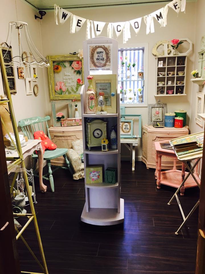
The photo above shows you an 8' X 10' room inside a multi-vendor store.
That vendor moved to a larger room, and a new vendor took over the space...
(I'm showing you this shot so you can see the huge difference as the space progresses)

Once Vendor 1 moved out, the room looked like the top row of images in the photo below: 
empty. and filled with blue light, most of it from the overhead florescent fixture. 

The challenges here: 
counteract the blue light. warm it up.
make the space seem larger. infuse some personality into the room to help tell a story. 

oh - and it all has to be removable, non-permanent, and CHEAP. 

sure, I can do that ;) 
 In the center of that photo, you'll see the 'DURING' segment.
,
In this phase, I brought in wall and window treatments that accomplished the main goals:
Warm up the space - the aged, yellow-gold tones of the vintage book pages & sheet music
help to counteract the blue-white walls and blue light present in the room.
To overcome that florescent fixture, I covered it with yellowed piano player music rolls.
The light is now MUCH warmer, without making a change to the bulbs.

Below, you can see details of the wall treatments that I created...

On the left below, which is actually the wall on the right as you enter the room,
I created panels of pages by gluing them onto simple posterboard sheets.
This made installation quick, easy, and possible for one person to handle alone (that would be ME)
and it also makes this effect easy to remove when the time comes.
I was able to create the panels in my studio beforehand, saving me time and money
over having to apply pages and pages directly to the wall.

On the right below, which is the wall on the left as you enter the room!, 
is a collage 'art piece' made up of a few more posterboard panels, an old projection screen,
player piano music rolls, and miscellaneous items like boxes, hooks, and books.


 The photo above shows a larger view of the left wall 'art collage',
which was created to utilize vertical wall space for the display of jewelry and wall art.
The hooks, boxes, and even folded pages of books will hold merchandise
well within reach of customers. Plus it's really unique and eye-catching!

The window, shown in the photo below, was partially covered with a 'valance' 
made out of piano player music rolls hung from a simple curtain rod.
The panels help to diffuse the blue light coming in (and keep you from seeing the metal security bars outside).

You can also see that I treated the funky shutters on the wall as a 'window',
adding a canvas' awning' above it from two curtain rods and a set of brackets.
(Eventually, when we find a mirror that fits the hole in the wall behind those shutters,
we'll install it and open up the shutters to enhance the 'window' effect - 
and the mirror will bounce more light around the room.)
Once the 'backdrop' was in place, I brought in some basic table fixtures to hold merchandise - 
a long, narrow table on the longest wall and a round tall table to the left inside the door.
The rocking chair, wood ladder holding the sign, and mannequin (under the coat) are funky props
that add interest and will hold a plethora of products.
This approach utilized the narrow space efficiently, and make it seem larger.

Then the merchandise was loaded in,
filling the tables, art collage wall, mannequin, window, and rocking chair with treasures
both vintage and handmade. That brings us to the 'AFTER' part of the photo.
(NOTE: this is not the same vendor that occupied this room in the top 'before' photo)

Now I'd like you to scroll back up to the first photo I shared.... it's ok, I'll wait!
Look at that room, and then scroll back down here and look at THIS room.
Both photos of the room were taken from exactly the same vantage point.
They don't even look like the same room, do they? 

The lower one seems to be wider, not quite so tall and skinny, and clearly warmer.
You can't see everything offered in one glance... things are hidden.
The room welcomes you in. It invites you to browse and discover what's offered,
 and take a bit of this mood home with you.

THAT, my friends, is why visual details count
It's all an illusion. And it can work in your favor.

Need help with YOUR space? Shoot me an email!

Fall Display Inspiration

Fall isn't here YET... but it's coming!
If you haven't begun planning and installing your fall merchandise & displays yet,
don't worry - just get to work NOW and get them up by August 1st,
 and you'll grab the segment of shoppers who are just gettin' in the mood!

It's always a good idea to get out of our day-to-day mindset and look ahead. 
Consider it the same thing as watching the weather segment on the news to see the extended forecast - 
we want to know what's coming up, how to plan, what to expect... 

In business, that can mean taking a singular message or concept, 
and creating a visual merchandising plan or an advertising or event plan 
that builds it from month to month or season to season. 
This basically tells your customers what to expect from you in the near future - 
and gives them something to look forward to. 

In retail psychology, it also creates a sense of urgency - a reason to buy NOW: 
'Get this season's products before they are gone, 
and be ready to get the next seasons's hot deals as soon as they release!'
.
I've rounded up some fall-specific posts from my archives to inspire you:

...just a few of the fall merchandise displays I've created over the years...
 
Don't forget to check out my seasonal content on social media!

Hey, Vendors - What's Your Sign?

I have a pet peeve when it comes to the vintage world...
It affects me when I am photographing a show.
It affects me when I am looking for a particular booth.
I see it affecting customers as they shop, and I wonder how many vendors / curators DON'T see it.

But then.... my pet peeve is something that ISN'T seen:
It's missing signage.

Sadly, the lack of a sign in a booth is a very common mistake.
At every show I attend (and that's a LOT), I see several booths without signage.
In photos shared on social media - by shows and even the vendors themselves! - I see it every day.
There have been times I'd love to have contacted the vendor who created such a lovely display, 
but I have no idea who it IS  - because they didn't make a sign with their name on it for their booth.

To quote Nancy Kerrigan, WHYYYYYYYYYYYYYYYYYYYY???
Why on Earth would anyone go to all of the trouble of having a booth in a show
and then NOT put their name on a sign in that booth?!
It defies logic. 

Especially when there are more easy ways to create a sign than I can count.
There are difficult ways, too, and that's fine... just make one, for heavens' sake!
Put that baby on your booth wall, hang it from your pop up, stick it on the front of your cash stand!

Here are some incredibly amazing signs that I saw on my recent trip to 
where some of the best vendors / curators in the vintage biz show off their stuff.
Yes, there are still people there who didn't have signs....
but THIS is how the PROs do it: 
Though all of the signs above are neutral in color, they have incredible visual impact.
From scale and lighting, to unique materials and simple construction,
you NOTICE the name of the vendor/curator in the booth as soon as you look at it.

Details:
Lisa Souers gathered up all kinds of letters and mounted them to old boards.
Junk Hunks revived marquee letters and lit them with patio lights.
Farm Salvation and FOUND painted on old glass windows.
Storehouse Goods painted on a rusty old windmill part.
Home Sweet Home painted on simple chalkboard panels.
Atelier de Campagne had a scrap of metal laser-cut.
The signs in this image all have color in common, running the gamut of the rainbow
while also presenting the brand of the business in visual form. 
As individual as the people who made them, they speak before customers are even IN the booth.

Details:
The Urban Gardener simply painted her biz name over a thrifted framed painting.
American Country Charm ironed letters onto children's denim overalls.
Marigold Vintage used a children's chalkboard.
Apron Strings used a cabinet door. Unexpected Necessities used a headboard.
This Old House painted on old wood planks.
Tailfeathers used blocks painted with letters, topped with birds.


This is basic marketing, folks... just like biz cards and social media accounts,
you need signage in your booth at a show, and in a store. 
Help customers find & remember you!
Help show hosts, photographers, writers promote you through sharing!

So.... to recap, you can use these items to make a sign:
framed paintings . chalkboards . children's clothing items . cutout wood letters . old wood boards
headboards . cabinet doors . old windows . old window screens . an old windmill tail
laser-cut metal scraps . salvaged sign lettering . salvaged marquee letters . salvaged ANYTHING
fabric . paper . posterboard . cardboard . paint . stickers . felt pens . pencils . crayons

here's some of the signage I created for my past vintage business:
 small signs on the cash counter and on the register    .   a flag flying over the booth
 a headboard made into a sign, attached to the fence outside my barn where my shows were held
decals applied to canvas panels that created sides of the booth
a painted kitchen cabinet door that hung from the tent frame
It wasn't hard to make those signs, and I used them for years.

Do YOU have a clever, creative sign for your vintage business?
Share a photo of it on my facebook page!

Farm Chicks, a Dollhouse, and Branding

In another chapter of my life story, I was a vendor at vintage shows.
The largest and most well-known show that I participated in was the Farm Chicks
a show with hundreds of vendors held every June in Spokane, Washington...
and a fanatical customer base of thousands of people who'd come across country to shop the show!

I was a Farm Chicks show vendor from 2007 to 2011
and I filmed my six-episode video series there in 2007. 
But I've never been to the show as a SHOPPER... until this year!
It was amazing... it's always amazing! 
There are many reasons why it's called 'The Happiest Show on Earth'!
I loved seeing my friends who are still vendors/curators.
I found a few special things to bring home, and snapped a LOT of photos.

But before I share the beauty of it all,
I wanna' share the BIZNEZ of it all.


Because founder and proprietor Serena Thompson is a branding WHIZ
and I know you can learn a lot from her... 

Every year, Serena selects a theme for the show. This year, it was 'Home Sweet Home'.
The centerpiece of her theme was the imagery of a dollhouse... 
and you can read what it was that inspired her here on the Farm Chicks blog
Serena also selects a color palette - and it's repeated in all of the elements she uses.

For example - the logo and all marketing collateral:
From the postcards to the vendor & guest badges to the show map
and even a photo frame for guests to use on social media, it ALL coordinates.

At every show, the main entrance features a HUGE display that reflects the theme...
I'm gonna' be honest here and say that I expected some big boxes,
assembled and decorated to bring that dollhouse artwork to life.
But nooooooooo, Serena surprised me with her eyepopping creation of BAKERY BOXES!
Read this post on her Farm Chicks blog to find out what inspired her
On the bottom right, you can see the Farm Chicks booth in the entry atrium.
The backdrop of that booth echoes the 'cross stitch sampler' lettering,
and the tables are draped in pastel quilts as they await final merchandise placement.
All of this reflects the qualities of a 'Home Sweet Home' and a dollhouse.

Vendors like the girls at Marigold Vintage and Unexpected Necessities
get into the spirit of the theme, too,
 by incorporating it into their wardrobes, booth displays and products:

The logo merchandise is thoughtfully coordinated with the color scheme, 
and displayed on the quilt-topped tables in groupings prettied up with simple props:
a few pieces of pastel-painted furniture, bright pastel tissue paper, and more
bring the small-scale coffee mug, flat fabric tees and canvas tote bags to life.
The attention to detail here brings the logo to life in living color,
and tells exactly the story that Serena wanted to.
She does this EVERY show! (see more Farm Chicks Show photos here).

There's a huge staff of Farm Chicks and Farm Hunks that help out at the show, too...
hauling purchases out to customer's cars and straightening displays... all.day.long.
(and how hunky do those guys have to be to be okay with wearing PINK tees, huh?!)
I've always been impressed with the way Serena brands her show...
I even filmed one segment of my video series in the Farm Chicks booth in 2007,
and discussed branding with her and Teri Edwards, her biz partner at the time:

Like Serena says in the video, she views the show as one big product
that needs packaging to sell it... branding is IMPORTANT!
Whatever you do, Tell Your Own Story* - 
and tell it with everything visual that you use!
*I've been using this tagline since 2002. And I really mean it!

In my next post, 
I'll share photos of some of the details of successfully merchandised booths that I saw at the show,
and you can see how truly PRO vendors / curators do it!
Until then... 

Going Green in 2017


Your Color of the Year for 2017:
Pantone 15-0343 'Greenery', 
described as a “yellow-green shade that evokes the first days of spring"
by Pantone Color Institute Director Leatrice Eiseman.

Pantone calls Greenery “Nature’s neutral”—
a hue more prominently worn during spring and summer, 
but one they encourage people to wear and use in decor as a statement color year round.

Greenery calls to mind the ‘re-’ words: 
refresh, revive, restore, renew, replenish, regenerate, rejuvenate, reinvigorate. 
It's reflective of nature, the environment, and living healthy lives.
It's fresh and crisp, denoting cleanliness and energy.
And it's a color that pairs well with almost every other shade on the color spectrum.

I've often created displays around a green palette in the past...
click here for post                          click here for post

click here for post                                 click here for post


As shown in these photos,
I find that green can range from a neutral to a vibrant POP of color
dependent upon the way you use it in displays.

To draw in customers who have a yen for the newest trend,
create at least one window display in green hues.

To feature new merchandise inside your store, 
create a backdrop / 'set' in green tones that will draw the eye - 
and simply rotate new stock into that 'set' to make new displays simple.

find inspiration for window displays using the color green here