* Effective January 1, 2024, I am officially retired! * My blog remains accessible online to share my decades of experience with readers who find inspiration, ideas, tips, tricks, and resources here in the many blog posts I've written since 2000. Thank you all for your support & encouragement, and don't forget to have fun with disPLAY!!!

Vintage Fall Display Inspiration

from 2012 to 2017, i worked with and for Rita Reade,
the proprietor of the creative vintage business Mammabellarte 
and co-founder, along with her sister-in-love, artist Christie Repasy, 
of The Vintage Marketplace vintage show in Southern California.

Rita hired me as her visual designer and stylist
to style all of her beautiful creations into an inspiring booth setting for each show,
as well as doing the same for the entrance to the show as a photo backdrop.

you'll find that many of the techniques & tips used here
are just in time for vendors doing fall shows,
as well as fall store window displays!


continue reading for all of the usable details...

Summer Display Switch-Up!

I'd like to revisit an archived post, to show you how making a fast, simple but large-scale change
can make an incredible impact in your retail displays for the summer season...
Come with me on a lil' trip into the past!
 I created displays for Columbia Winery in Washington state for six years. Here's the 'logo' wall made of faux tumbled marble tiles in the front entry of the shop, filled with spring merchandise.When it came time to install the new summer displays one year, we had a bit of a dilemma: The summer merchandise is very contemporary, and in colors of white, silver, and blues. With that warm-tone, old-world style tile mural, we had some serious clashing going on that did nothing at all for the product.
I needed a solution.
Enter two very large mirrors that I had on hand, purchased for decor at a previous Auction of Washington Wines Winemaker Dinner. I decided to use those mirrors to cover up the tile. (IKEA, $135. each). I had my design assistant Karen help me heft them up onto the table, then I wired them to the sidewalls. There was still some tile showing, so I hung a white drapery panel on the side. In front of that went one of the two driftwood trellises that I purchased last year as summer props. On the top, to camouflage about six inches of tile, I hung white shutters at an angle - very 'Tommy Bahama'. Other shutters went beneath the table to lighten up the shadowed area a bit.

The result?
It was shockingly different from the previous look, and got a LOT of positive comments!
The mirror not only reflected the natural light coming in the windowed front doors straight across from it,
but it also bounced light from the overhead trac fixtures right down onto the glass merchandise.
Here's a shot of the entire main display, including the forward area with wine feature.
The tables are made from driftwood, and are for sale. Those driftwood trellises weren't for sale. The white chair was mine, and also was not for sale, just a prop. (That I fished out of a dumpster - really!)

It took maybe half an hour to install the mirrors, curtain, shutters, and props for that front display.
  Well worth it, wouldn't you say?

Now, think about what you might be able to do in your retail space....
with some old doors, or a section of cedar fencing, or maybe even salvaged rusty corrugated tin roofing.
The possibilities are endless, 
and the impact of a big change could be just what you need for the summer season.

Now.....where are my sunglasses? I'm heading for the beach......

this content originally appeared here on DWK visual merchandising blog in 2007.
photos mine, copyright reserved. 


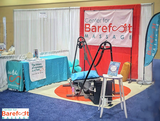
trade show booth concept design

booth displays,show booth design,show booths,display tips,brand image,entrepreneurs,Gift Show,redesign,retail store design,showroom makeover,space design,store design,trade show booth design
here's a look at something you haven't seen much of on my design blog:
the design concepts i create for NON-retail spaces.

i've shared a few trade show booth shots before,
including the display setups i've created for wholesale gift shows in the USA.
i've also shared the redesign i undertook with my daughter
in her 'Heeling Sole' barefoot massage studio in Texas several years ago.
(i'll link all of those posts at the end of this one)

when you combine those two things,
you have Deb designing a trade show booth concept 
for her daughter to set up at the national convention of her industry...
 i'd like to share the project with you with the goal
of helping you prepare for any trade show, convention, even pop-up space
that your business might have as you promote what you do.

continue reading for my narrative and Jeni's input on our process
and how those goals were met...

what's in YOUR windows for the summer season???

.  
summer is here (unofficially) and if you haven't done it yet,
it's time to refresh shop windows AND online photos for the season.
gather up the red, white, and blue products & props in your storage room
and let's get you in motion to create effective displays!

my best VM tip:
Selecting a general theme and a seasonal color palette is what works for us in this resale store.
The choice of a patriotic palette for summertime is easy, and draws customers like flies.

It can work for you, too, no matter what you sell - 
because a window 'set' that can simply be filled up with new products on arrival
saves everyone time & effort.

continue reading for classic summer display ideas,
created for an upscale thrift/resale store in Southern California...


A Blooming Spring Display

One of my former clients was a local vintage / antique show.
Every three months - once per season - this event took over a local park,
filling up with 60+ vendors of vintage and vintage-inspired goods in beautiful booths, 
and drawing crowds of thousands of people over two days.

And lucky me, not only did I get to SHOP the show each season, 
but I was let loose to create a fun, fanciful, and enticing entry display!

The goal was to create an area that welcomes guests / shoppers, 
reflects the seasonal theme of the show,
and provides an opportunity for guests to snap photos of themselves & friends
as souvenirs of their happy day.
They also happen to share those photos on social media, which helps to promote the event!

In January, the spring show planning began. In February, the show producer and I 
spent a day creating huge flowers from paper for the display at the entrance to the show.

continue reading to see more...

Spring Fling

It's still cold, gray, wet, and miserable....and winter isn't about to let go yet.
But are you offering your customers a healthy dose of Spring Inspiration?
You should be!

Continue reading for some ideas to help you get started...