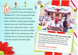
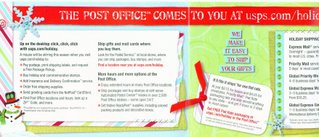
 Yes, you saw that right.....the HOT seasonal color scheme of red, lime green, and aqua blue...AND it's SCRAPPED! Talk about grabbing onto a wave and riding it for all it is worth. SOMEBODY down at USPS headquarters is a marketing genius, that's for sure. This mailer went out to residential customers....and with over 70% of the population scrappin' away, they are sure to win raves for this. I have to say, normally I'd recycle something like this - straight into the bin, that is. But THIS one...it's going on my inspiration board, just because it's so appealing to look at.
 Every surface of the fold-out brochure is cute cute cute, filled with ideas and inspiration. I don't know who designed it (I'm not a 'scrapper', so I know very few 'names' in the biz, but I am a collage fiend!) but they did a fabulous job. It reminds me of the old Rudolph and Frosty animated specials, for some reason...a nostalgic vibe.
Oh, and it has some pretty handy info on mail deadlines & guidelines, too.... ;o)

That magnificent scrapper is Erica Hernandez...you can find a link to her stuff on my blog!! Go Seattle!
ReplyDelete