If there is one word that expresses the mood of Autumn, it is 'Harvest'.
And that leads to Abundance - a very important concept in retail visual merchandising.
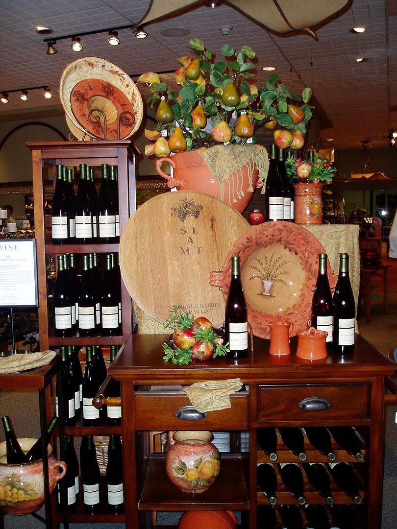
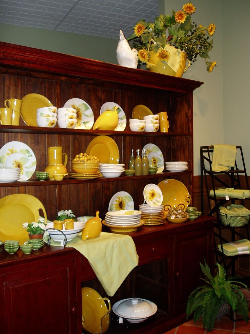
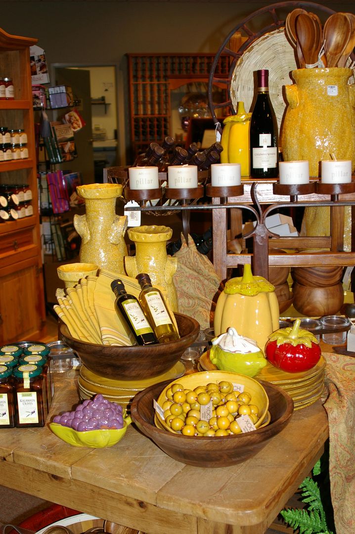
Your goal is to attract your customer's eye with a display that is full of product.
Product to discover, to look at, to investigate, and to purchase.
(Don't forget your signage!!!)
The best displays have two elements...
click 'read more' to find out what they are and how they work!
Successful Displays have two main elements:
1. a 'lifestyle' or 'feature' area,
click 'read more' to find out what they are and how they work!
Successful Displays have two main elements:
1. a 'lifestyle' or 'feature' area,
where a grouping of products creates a mood, a theme, etc.
2. an
adjacent table or shelf unit
or shelves on a wall
or shelves on a wall
that holds LOTS of those products -
all neatly
corralled or lined up, easy for a customer to grab n' go.
(in merchandising talk, that's known as "stack 'em and pack 'em" !)
It is very important that
both the 'feature' area AND the 'stock' area are always filled with
product.
Neat, clean, but FULL.
If
you have a low amount of the items and can't fill it up,
you need to
build a smaller display and get a smaller fixture to put the stock on.
Or you need to bring in some additional products, and cross-merchandise
it into your theme.
or in a sleek, contemporary display...
It matters not whether you build it in a geometric
grid form or a freeflowing arc.
It matters not whether the fabric is
draped in great swaths across the table,
or hung vertically from above.
Any display of product, any theme, any style, in any store
will benefit
from having additional product easily available immediately adjacent to
it.
I mean, I just loooove
creating those lifestyle tableaux of spilling items,
draped fabrics, and artfully placed floral accents.
I really do. It's like a still life
painting come to life.
(Which, I know, kind of negates the term 'still
life'...but anyway....)
The most glorious, opulent display won't
sell your products on its own.
It needs to be partnered with
accessibility -
otherwise known as shopibility!
Customers want to be able to grab a few widgets and head to the cash register -
they don't want to have to extricate each and every item from a foofy display.
So make it easy for
them...and for your sales staff.
The bonus is, it's also MUCH easier to re-stock products in this format
AND your display might just stay intact and pretty for longer than five minutes.
AND your display might just stay intact and pretty for longer than five minutes.
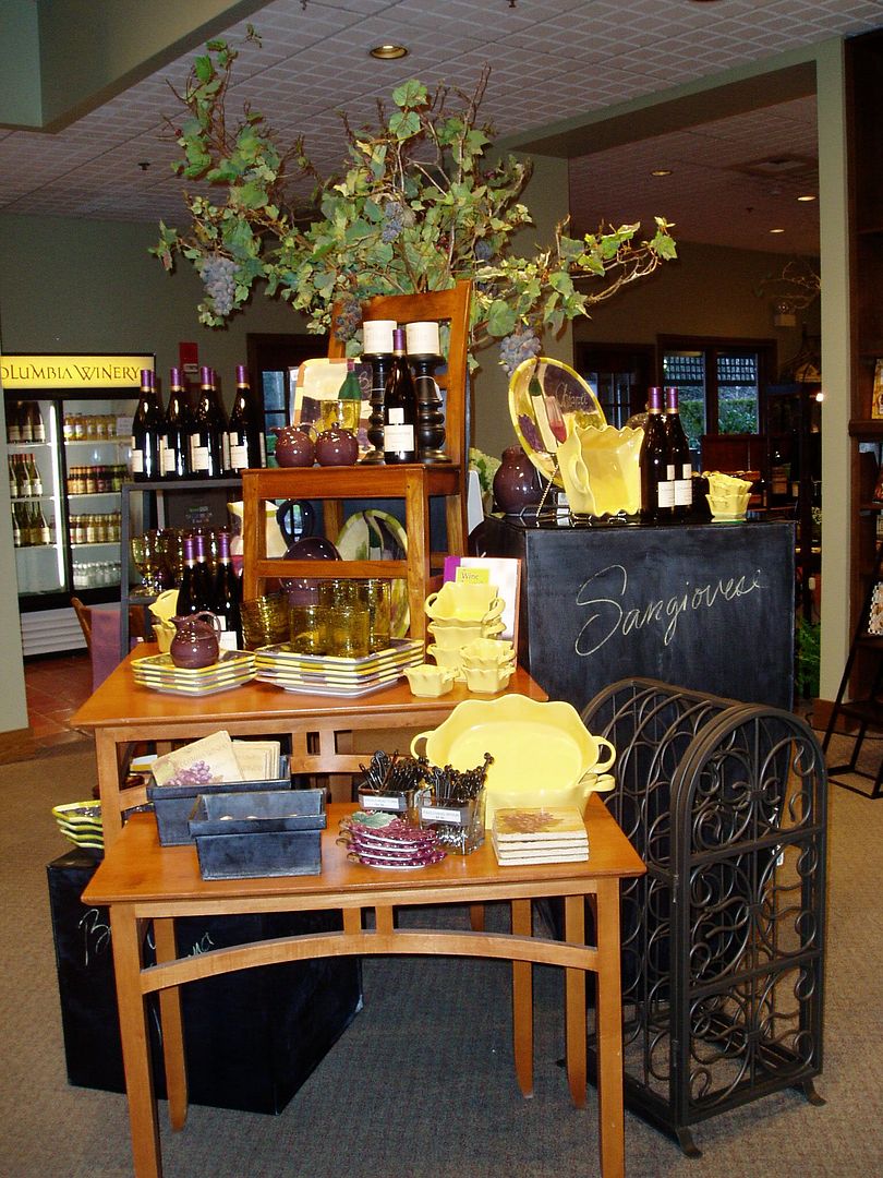
The display above is staged to be viewed from front AND back.
Several metal towers in the grouping hold the wine en masse,
while the tableware takes center sage on the wood fixtures.
An abundance of product, ideas, and inspiration will reap a harvest of sales this season...
(Photos copyright DWK 2006 at Columbia Winery)


No comments:
Post a Comment
If you work for a business in the retail/wholesale industry and are planning on leaving linked comments on MY blog posts to promote YOUR business, be aware that it will NEVER happen. I will immediately mark your comments with links to your business as SPAM, then delete them. Your comment will never see the light of day on my blog, nor will I ever promote your business for you... I will never publish them. Aars Exhibits, you have been bombarding me for four years and not one of your thousands of comments has been published here. I have emailed your company multiple times to explain this, but you persist. Get the hint. You can stop now!