I am anxious to share the redesign of Hogue Cellars with you all....but I have 250 photos and it is NOT easy choosing the right ones to illustrate Before/After concepts! If I tried to include them ALL, I'd have a blog post worthy of Tolstoy. I could call it "The War and Peace of Retail Design", I guess...but you'd be bored and Blogger would implode. SO, I will have to tackle this in phases.

Take a look at that sketch of Hogue Cellars retail shop & tasting bar. Front door is mid-right, tasting bar is lower left. Cashwrap is the 'C' and 'I' shaped counters in the upper center. Just about everything else shown is shelving, cabinets, slatwall, etc - built-in units. Got your bearings? OK! This post will include shots of the upper right quadrant.
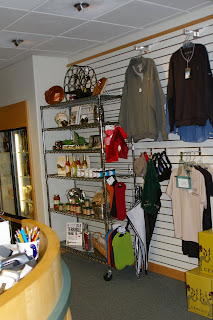
When you walked into Hogue BEFORE Deb and her marvelous 'Decorating & Display Diva's Crew' wreaked havok, here is what you saw when you turned right:
.JPG)
It's not horrifying or anything, it's just not the best it can be.
A few minor changes, and here is what it looks like NOW:

Clean, Crisp, Well-stocked. Organized. Upscale. The best it can be!
Now, the details:
.jpg)
.jpg)
Before & After
Side by side, you can see the differences in the slatwall arrangement.
This area formerly held food & wine accessories on a wire rack, and logo apparel on slatwall. We removed the rack, and the food, and focused this area completely on logo and wine accessories -some of which ARE logo. Before, there was one item in each style of shirt & cap out here - big no-no. 'One-sies' look like they are leftovers, end-of-line merchandise. Customers won't buy it because they think you have had it forever and ran out of other sizes. We filled it up with all four styles of shirt in all four sizes (they hang S-M-L-X) and it looks like brand new, fresh merchandise. Did you even see the caps in the before shot? Nope. Now there are multiples, easy to see & grab. The accessories are corralled into baskets that fit into shelf units. (Each pulls out like a drawer for ease in stocking, no wasting time stacking on a shelf. Expedite the process for your staff!!!) Now it's shoppable.
Moving to the next wall (top of map), we saw this before:
.jpg)
Again, having just one of an item out on shelves is detrimental to it's sales potential. One box each of six varieties of crackers, one of each varietal of wine....nuh uh. It looks like leftovers, spoiled and soiled. The thing was, there were boxes and boxes and shelves FULL of these products out in the retail storage area. My trusty helpers loaded up and hauled it all in, I organized it into categories and arranged it onto the shelves (pasta, sweets, savories, spices, oils, fish, etc.). Books sell best when you can see the covers. (OF COURSE we have all been told "Don't judge a book by it's cover" - but we still DO it!!!) The previous arrangement of over 30 cookbooks was removed and those books that were alike (not many) were placed into displays by color, theme, content, etc. Books sell much better when cross-merchandised.
And here is the result:
.jpg)
On the left you see a counter area. I actually used the exact same merchandise that they already had there, I just added more of it and propped it in a way that was interesting. In the before shot, you can see that it was flat, on a checkered tablecloth - which was a cute idea, but I went for a more 'Williams-Sonoma' look than Papa Luigi's restaurant. Bushel baskets hold lots of pasta, the ceramic bowls hold sauces, and the colanders and cookbooks add interest:
.jpg)
A few employees looked at the display the next morning and asked "Is this new? Did we have sauces before?" This kind of reaction is typical!!! Sometimes you have to shake it up to see it. And as of today, that wall-hung candleabra is gone, along with all of the backstock, along with a bunch of other merchandise. It's 'flying out the door', I am told.
;o) Gotta' love that!
Next time, we'll continue moving around the shop counter-clockwise....

LOVE the "befores & afters!" Great job, thanks for sharing your project with us!
ReplyDelete